Bathroom Design & Colour Scheme Ideas 2018: Tips to Choose the Best
Because you want the best of whats trending in bathroom design & a look that will not date poorly.

How to get the Best Ideas for the Bathroom – A Design Perspective
There is a lot of detail that goes into a bathroom.
If you’ve renovated or built before then you will know how overwhelming it can be getting things done right…
The good news is that you can make it much easier to choose what’s best by following some simple design principles. We have covered designing an easy to clean bathroom, and now in this article we cover bathroom colour schemes, including what’s trending for 2018.
Whether you have a small, large or unusual bathroom layout, your choice is important in influencing the final product.

The best bathroom colour ideas & styles come with a design perspective in mind, generally starting with tiles and then working backwards from there. This item-by-item guide covers each major aspect of the bathroom colour scheme.
If you are interested in skipping the guide to see what’s popular for 2018, we have some quick links below. You can also refer to these, see what you like, narrow your choices and come back to the guide.
The trending bathroom colour schemes for 2018 include:
- Gray Industrial & other Gray-tone: including concrete & cement look bathrooms
- Ecclectic Colour Splash: playful colours such as teals, pinks & blues in small doses for features such as basins or tiles
- Plank Tiles & Timber Hues: Including tiles that imitate genuine timber
- Limestone: Neutral stone colour throughout the bathroom with standout fittings
- Terrazzo: Genuine terrazzo or porcelain used with complementary colour
- Coloured Tapware Finishes: Matte black, rose gold, brushed nickel, etc.
- White: The timeless colour, matching anything and remaining popular year to year
Now back to the guide
Let’s start with the most important aspects, get the most important right and your bathroom is sure to look great.
Tiles are the most important part of bathroom design

Tiles are the most significant part of a bathroom’s final look and feel, both the type of tile used and the colour of the tile significantly influence the outcome of your design.
The best bathroom designs & colour schemes today have tiles that exude:
- Perceived open size & space
- Perceived warmth & invitingness
- Pleasant feeling
- A desirable ambiance, and;
- Are practical for the long term
Generally most bathroom tiles are laid in a way that directs the eyes in a particular manner, the most commonly used design formats are listed below.
Two tone bathroom: Two predominant colours are noticeable in the bathroom. This set up grabs attention with a darker, bolder colour that catches the eye whilst a lighter coloured tile softens the look, helping add to the illusion of more space and a more open feel.
You can also do the reverse with the light colour grabbing the attention however this requires a large open room and/or plenty of light to pull it off.

Historically, two tone bathrooms have simply been “dark floor, light wall”. With current trends, a feature is often added, the most popular feature being an entire wall which matches the floor. You may also have a small feature, such as a mosaic tiled niche inside the shower or a vanity splash back.
The two tone bathroom works best with a large wall that you see as you walk into the bathroom which you want to stand out. This is a great set up for a simple design and practical look which will most likely still fit future trends as two tone bathrooms have been around for a long time.
Choosing the light colour tile – Its best to choose a tile with a mild pattern in it to not detract from the darker tile. For rooms with less natural light, choose the colour as light as possible to maximise the feeling of space, whilst if you have excellent natural light in the bathroom or will use strong down lights you can go with a tile that is not so light. Examples of popular light tile colours include gloss white, matte white, limestone look tiles, Carrara look tiles, washed out concrete look tiles, mild beige tiles and light greys.

Choosing the dark colour tile – You can be liberal with your choice of bold patterns & texture to draw eye attention, though this is optional. If you decide to do a feature wall, ensure it blends well with the floor or is the same tile. A suggestion to make the tiles pop more without going too aggressive with the pattern is to use creative shapes such as hexagonal tiles, herringbone or arrow laid tiles and tiles that look like timber.
Single tone bathroom:
There is one predominate tile in the bathroom. Features, if any, are small and/or discreet. This set up works best with large format tiles and is perfect for making your bathroom look as large, open and inviting as possible.Single tone bathrooms are ideal for small bathrooms, especially if you use a tile colour as light and as large as possible, this gives the illusion of space and ensures a small bathroom feels open and more inviting. Combine a single tone bathroom with other details such as wall hung vanities, in-wall toilets and walk in shower screens for the maximum effect of space illusion.

Single tone also works really well with large bathrooms to “fit the character” and is truly a universal look. This set up works best with warm tile colours or tiles with strong varying patterns such as a marble, limestone or travertine look tile though there is a strong trend in 2018 to use greys and whites as well. If you use cool colours, ensure you introduce some elements in your design that are warm.
The single tone bathroom is perfect for those who like to dress up the bathroom with all the other fittings, such as with creative coloured vanities, feature bath tubs and toilets because the tiles do not draw too much distraction from those items and it allows maximum flexibility with “two tone fittings”, which we will talk about in more detail later in the guide.
Choosing your single tone tile – You may go with as much, or as little pattern as you want, and then work backwards from there for the rest of the bathroom design. Tiles with lots of pattern tend to hide dirt better than tiles with little or no patterns in them. The flip side is that tiles with little pattern offer the ultimate flexibility with the rest of the bathroom design, as they will distract less from a stand out vanity or bath. Generally you will find a few options in each category. For example if you like tiles that look like light marble with dark veins: the Statuario design has a much stronger pattern than the Carrara marble design, where-as Calcutta is somewhere in the middle.
Some bonus advice for picking the best tiles that will date well are to look for things that are practical. Historically, trends that have not dated poorly have had practical value. Some examples include:
- Larger tiles result in less grout used, hence tiles have become larger over time
- Gloss tiles on the wall are easy to clean and have remained popular
- Porcelain tiles are more durable than ceramic, and lower maintenance than stone
- Timber look plank tiles are more practical than genuine timber and look great
These elements of practicality are what have prevented things such as large tiles or porcelain tiles being a fad, whilst odd-shaped decorative tile, preppy artisan handmade tiles & small mosaic tiles consistently cycle in and out of trends and may not be for everybody.

Keep these tips in mind when you visit a showroom
When choosing your tiles keep in mind the pros and cons of each class of tile, some examples of the most popular are below:
- Porcelain tiles are great value for your floors and have the best density, hardness & durability. It’s also nice to have porcelain on your walls for the high end look, though;
- Ceramic tiles are cheaper and have more vibrant colour options. For example an absolute white ceramic will be whiter than the whitest porcelain, and so forth. Ceramic tiles are soft and best for walls. Your tiler will also have an easier time drilling when installing fittings
- Stone tiles are beautiful but are high maintenance and require perennial sealing
If you are finishing your walls or floors with materials such as glass, polished concrete or slabs/sheets/paint, the colour is still very relevant, however you may find there are less avenues to express your creativity. In the case that you are not using tile, you can still apply the same design principles outlined earlier to maximise the niceness of your bathroom.
Fittings (fixtures, fixings or PC items) complete the look

It’s important to note that tiles aren’t the only part of the bathroom!
There are also the fittings:
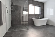
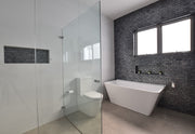
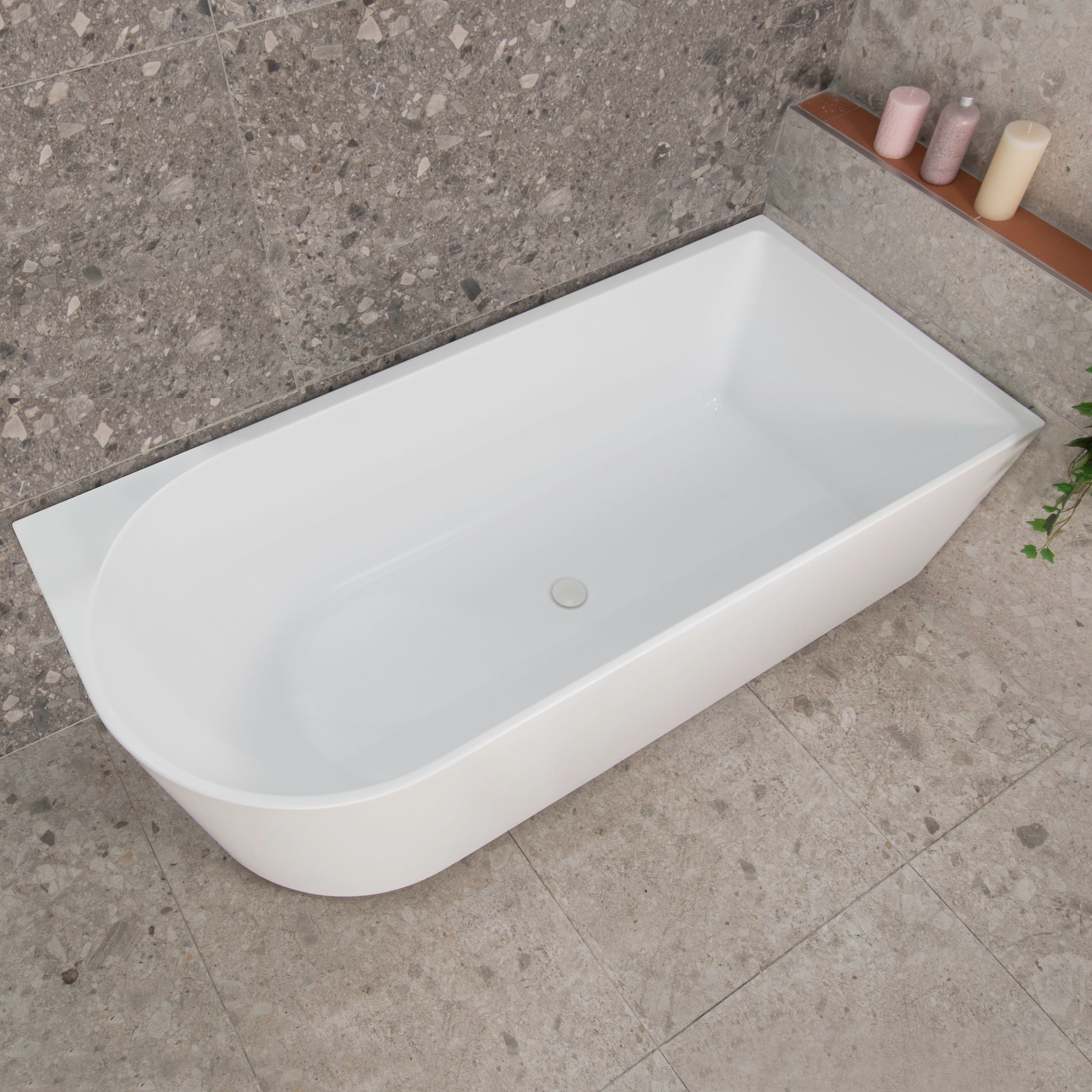
- Bathtubs can be free standing or inset, they make great features or subtle inclusions
- Toilets have been traditionally put out of view by bathroom designers, though modern toilets can look quite nice and add to the design of the bathroom
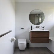
- Vanities can be wall hung or floor mounted, and come in a variety of colours.
- Tapware come in multiple finishes and colours, a few are particularly popular now
- Shower Screens can have interesting frame, brackets or glass options
- Accessories such as your toilet roll holder generally match the taps, and;
- Grates come in multiple styles and designs
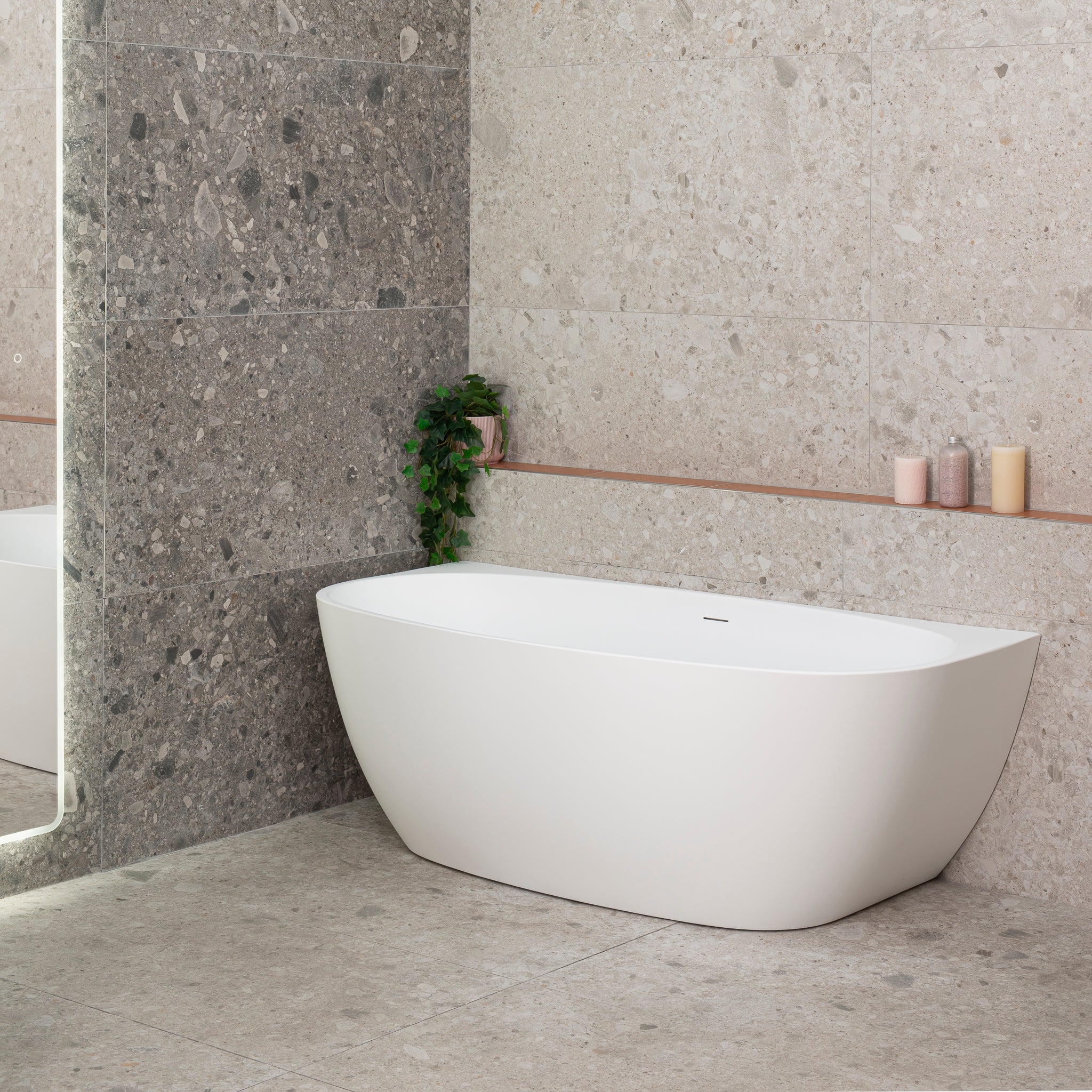
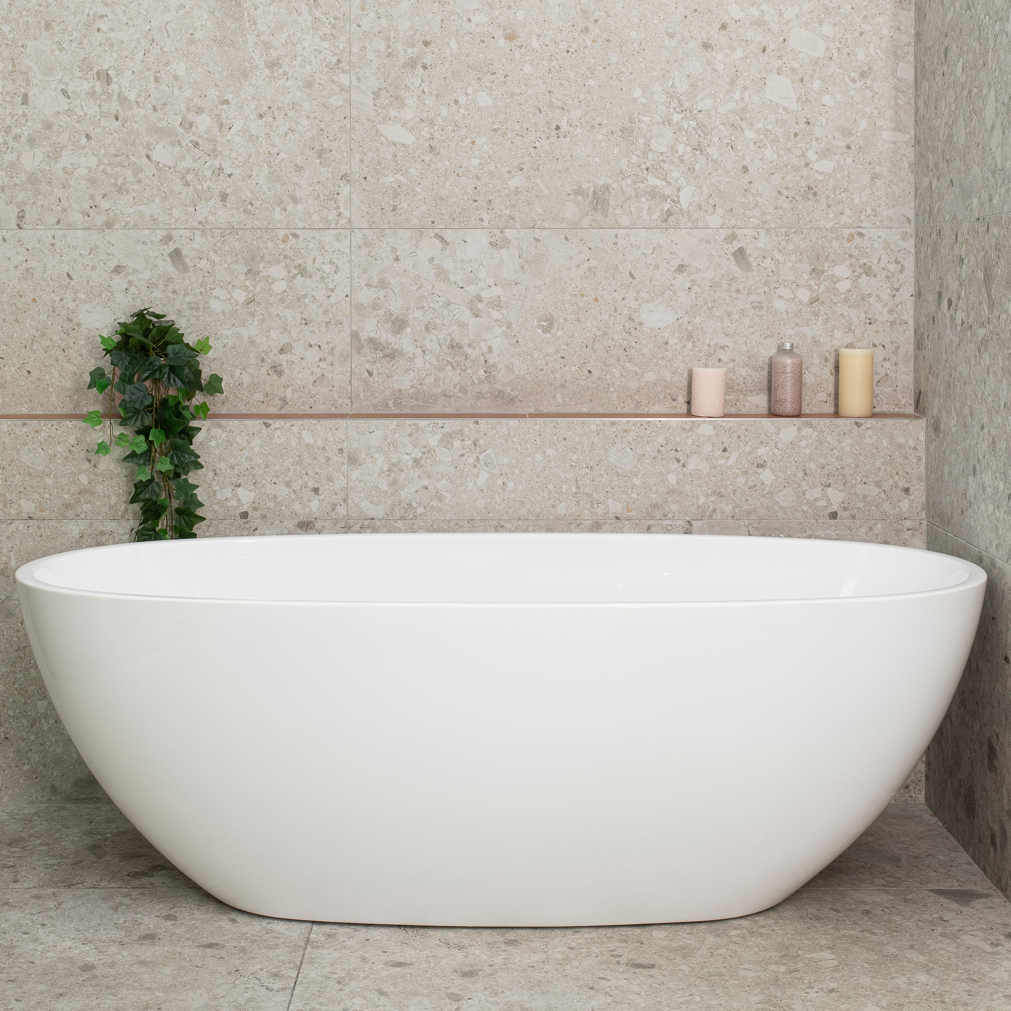
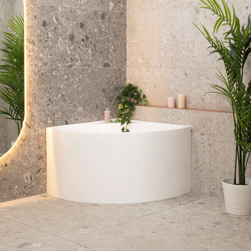
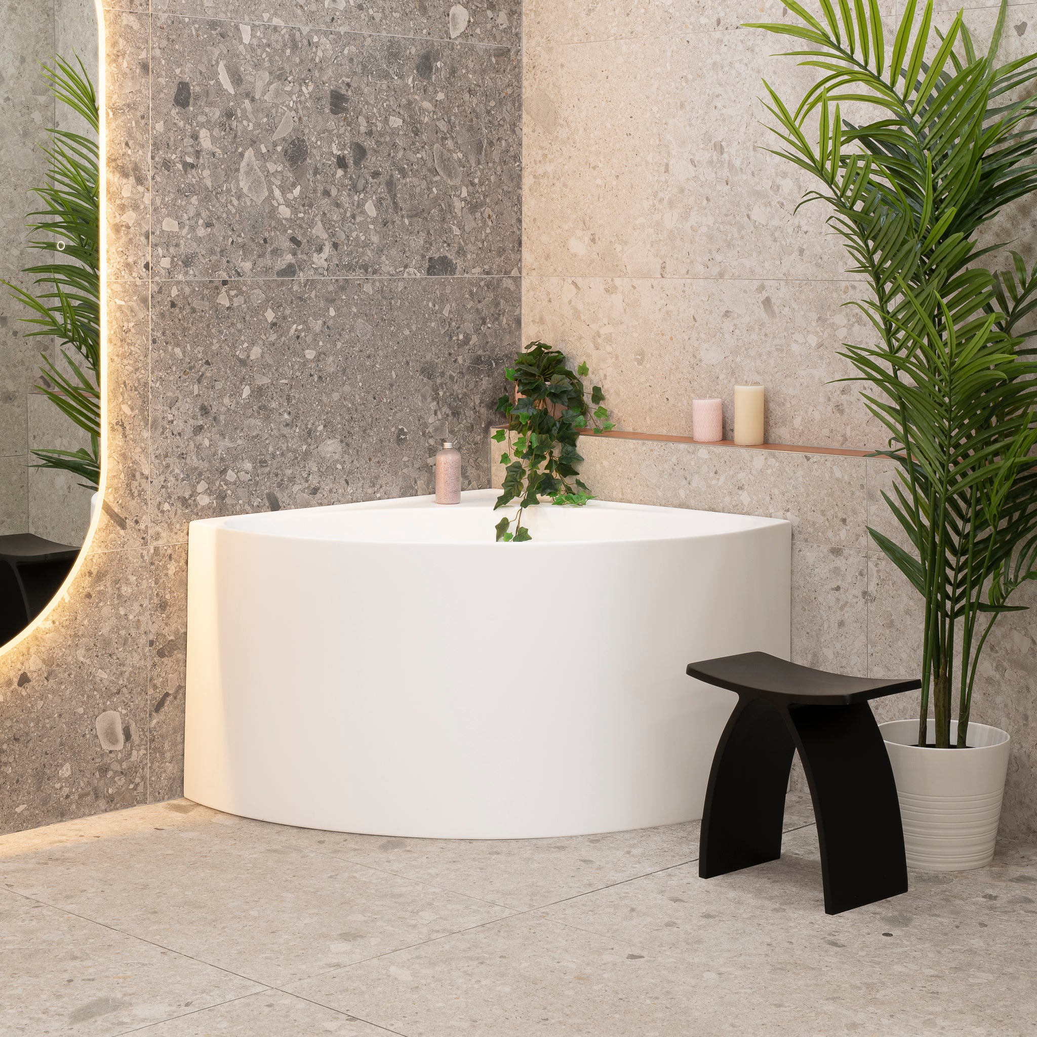
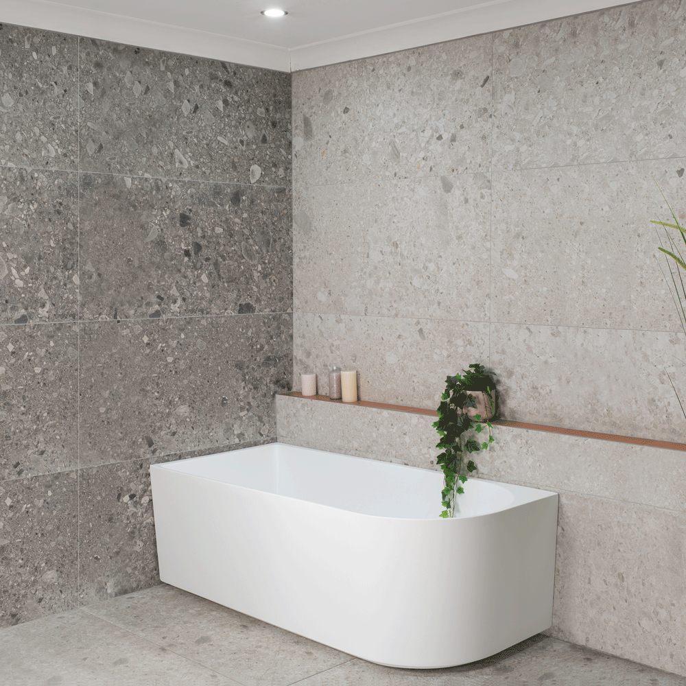
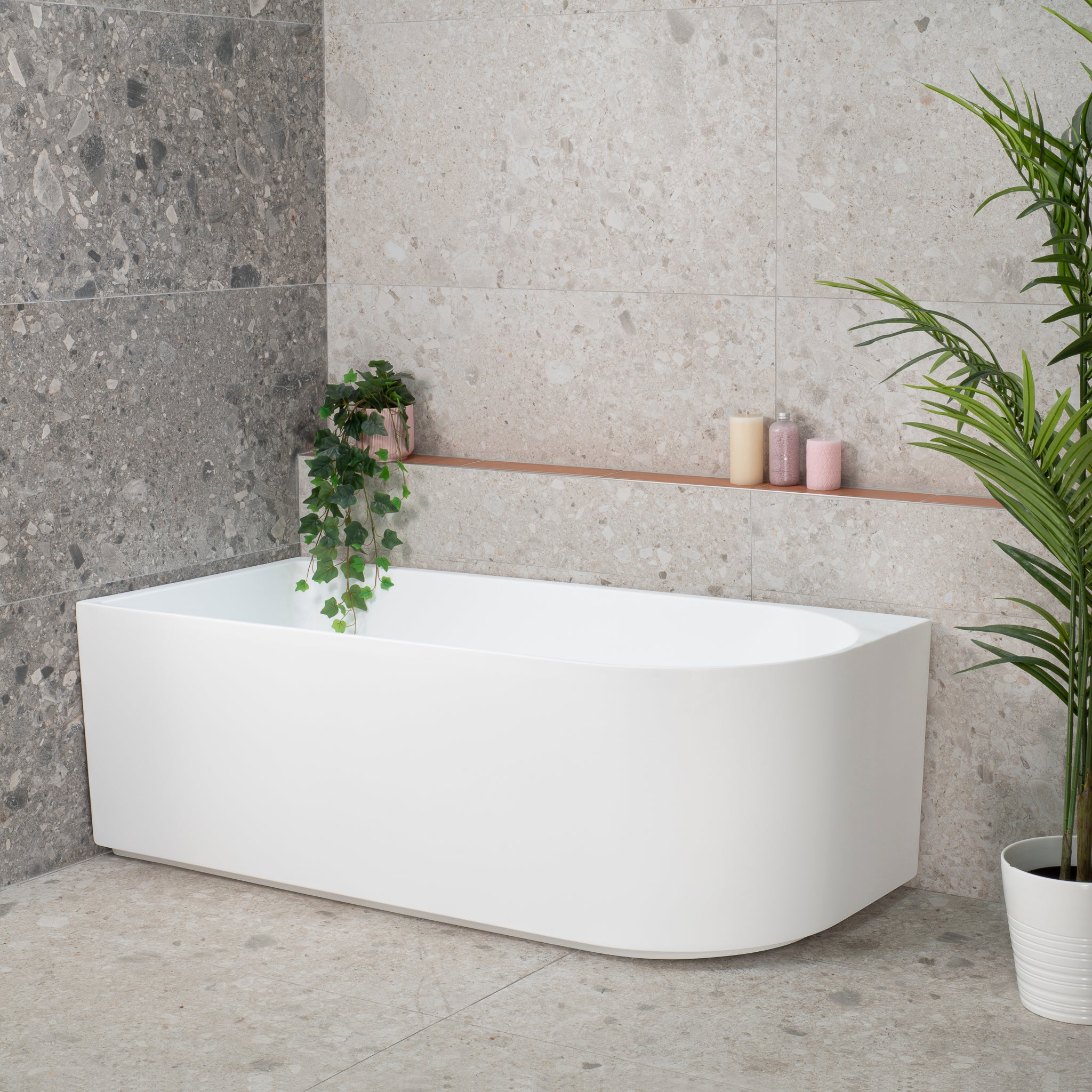
You are probably familiar with bathtubs and toilets being white, a hygienic colour both conservative and vibrant, it’s also an easy colour to produce. This makes white great for all purposes, including looking good with almost any bathroom design.
You may remember pink & green toilets from several decades ago, these temporary fads haven’t held up as long as white, the timeless colour. Just like with tiles, generally what remained relevant over the years had practical value.

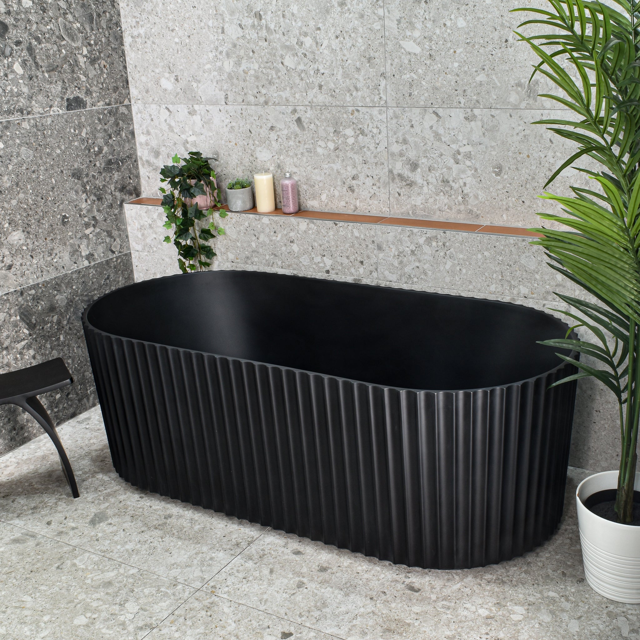
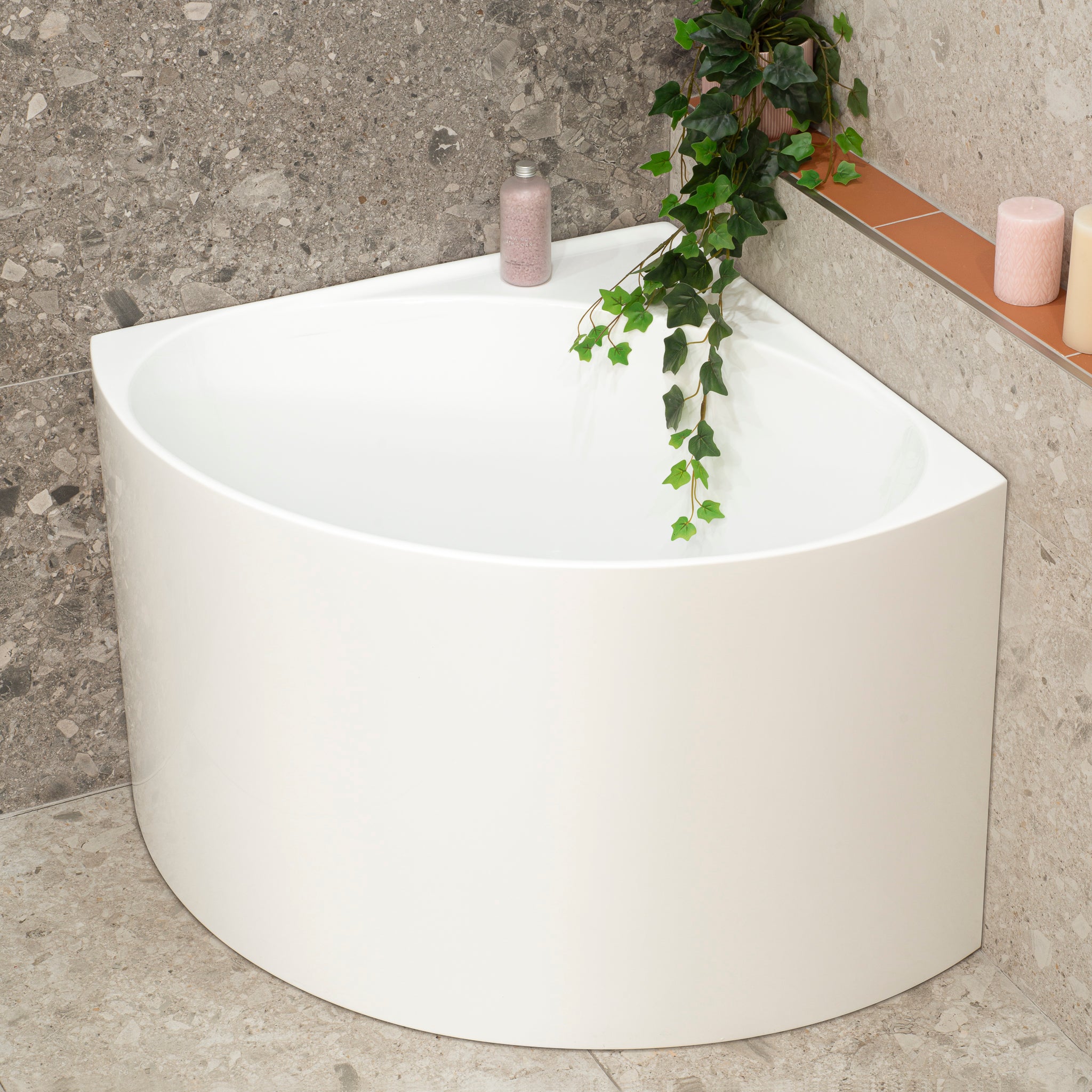
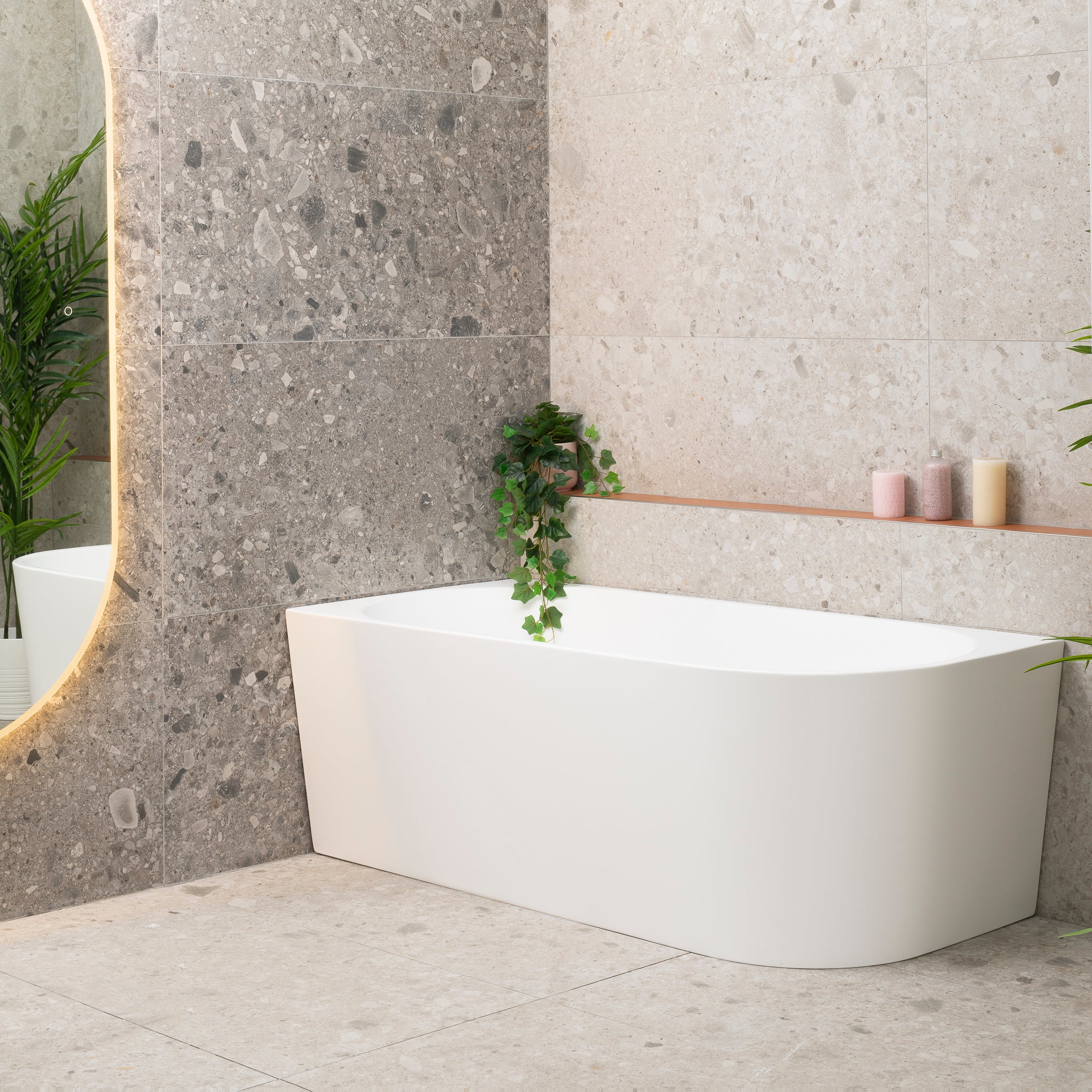
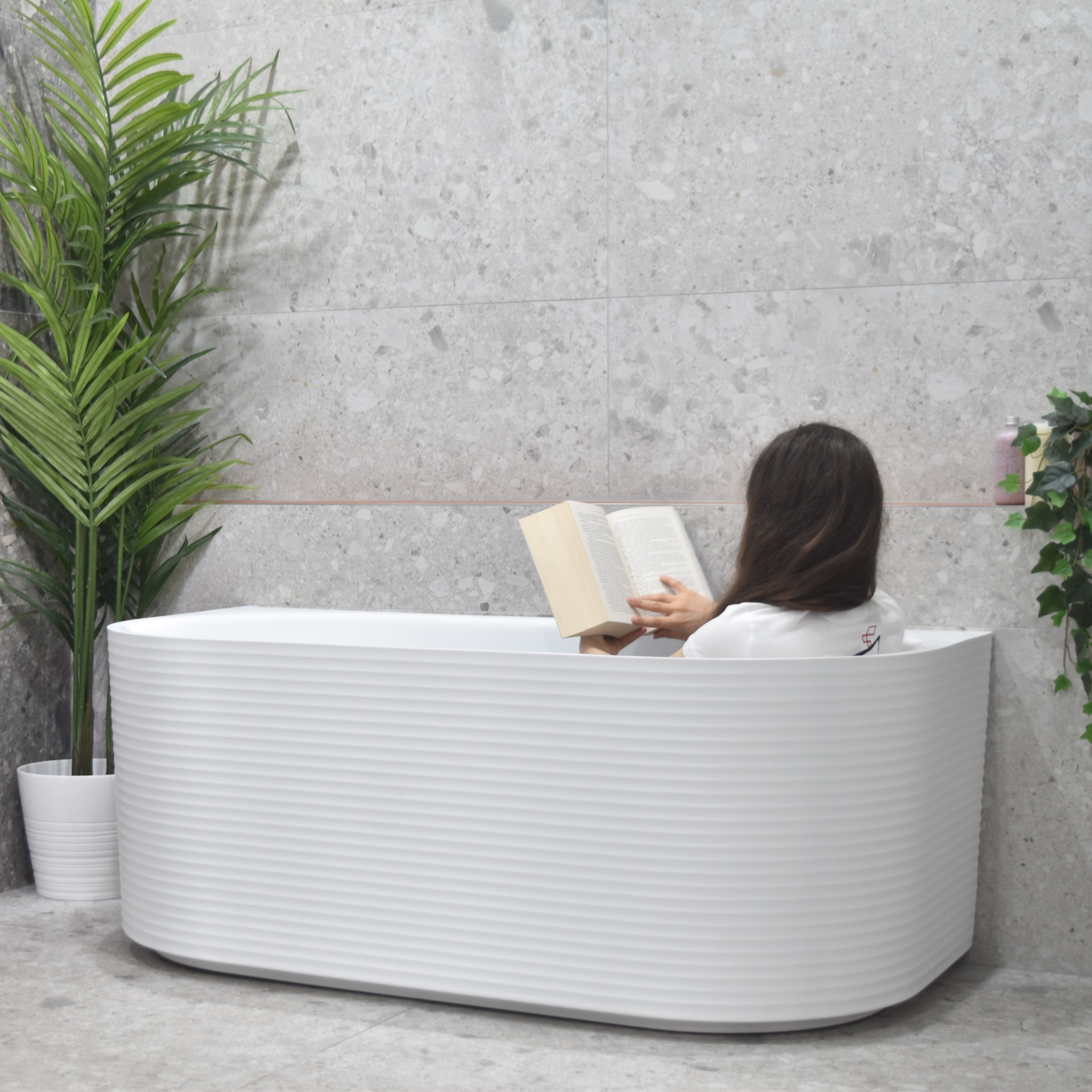
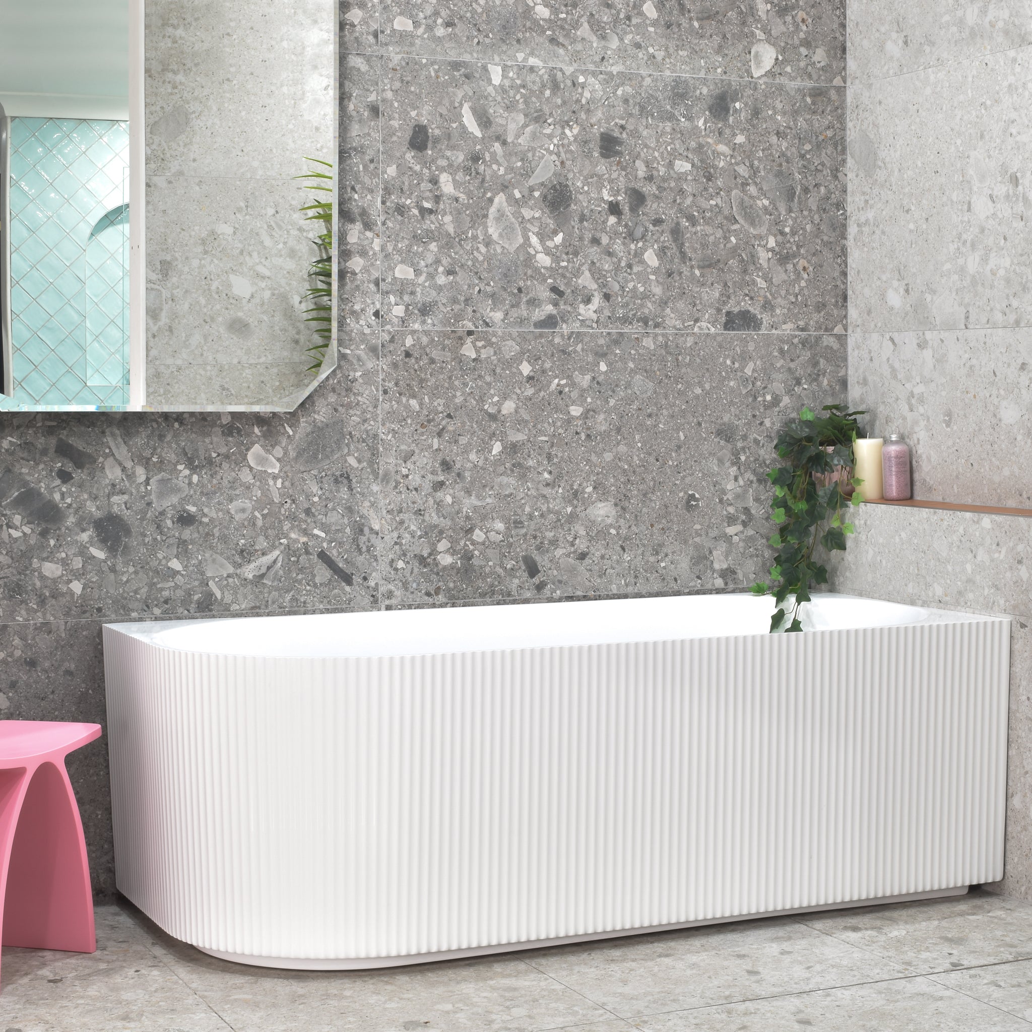
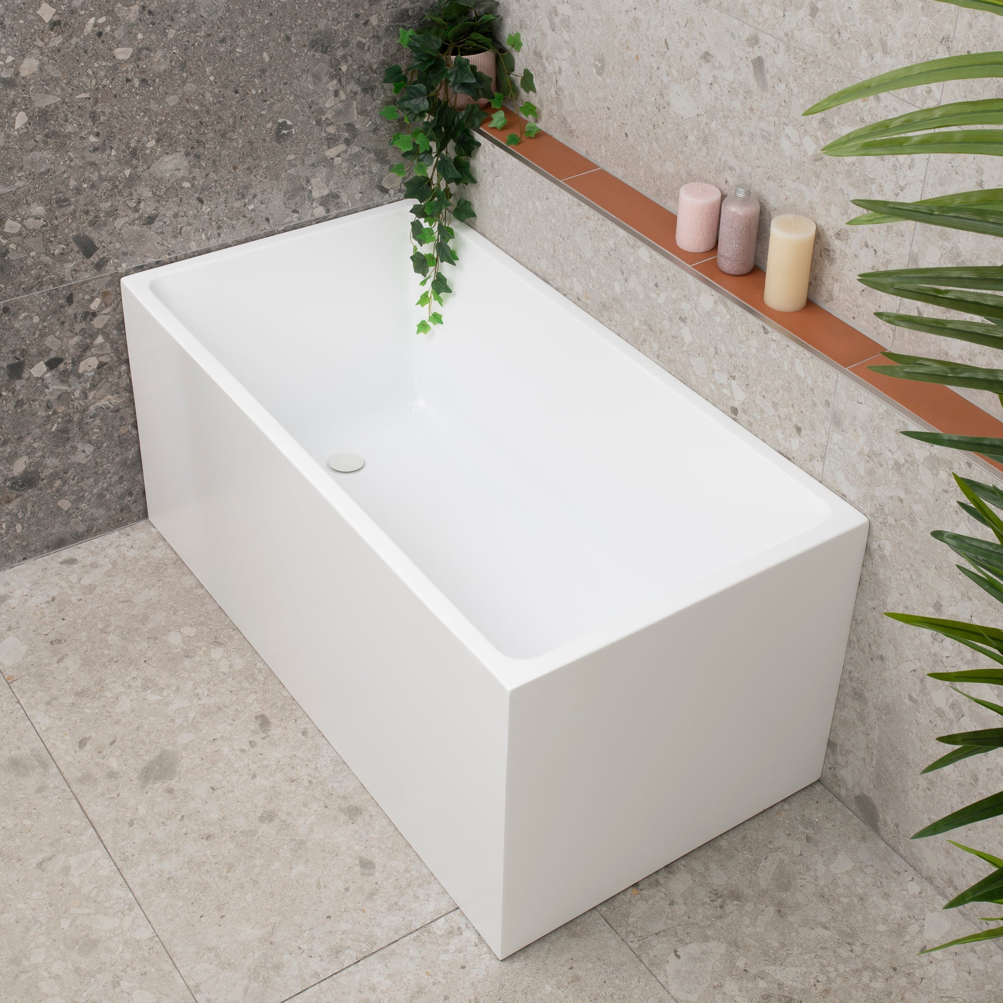
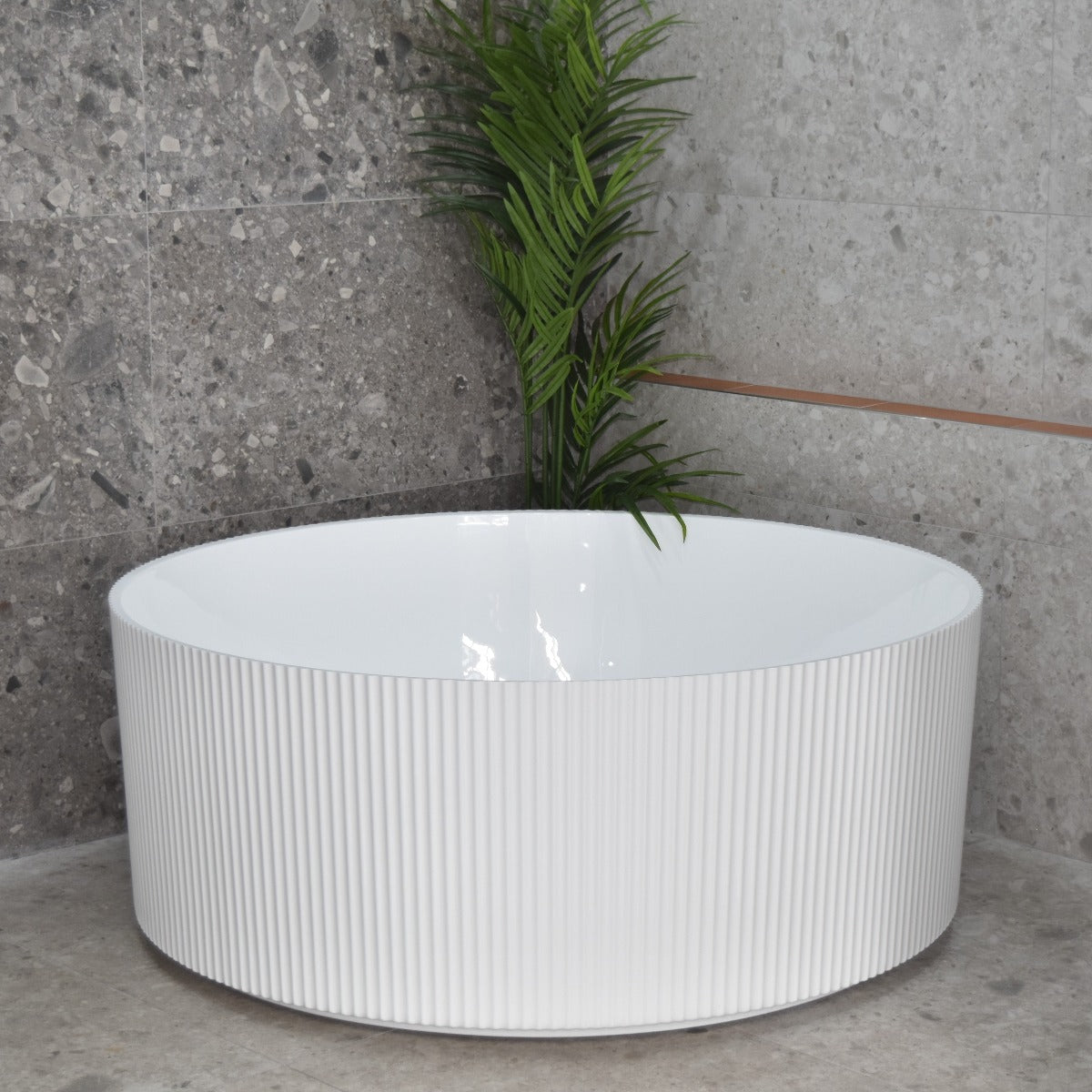
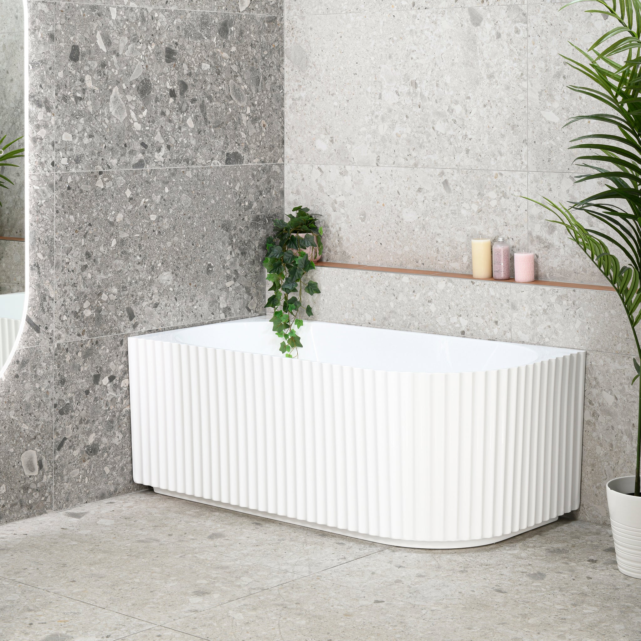
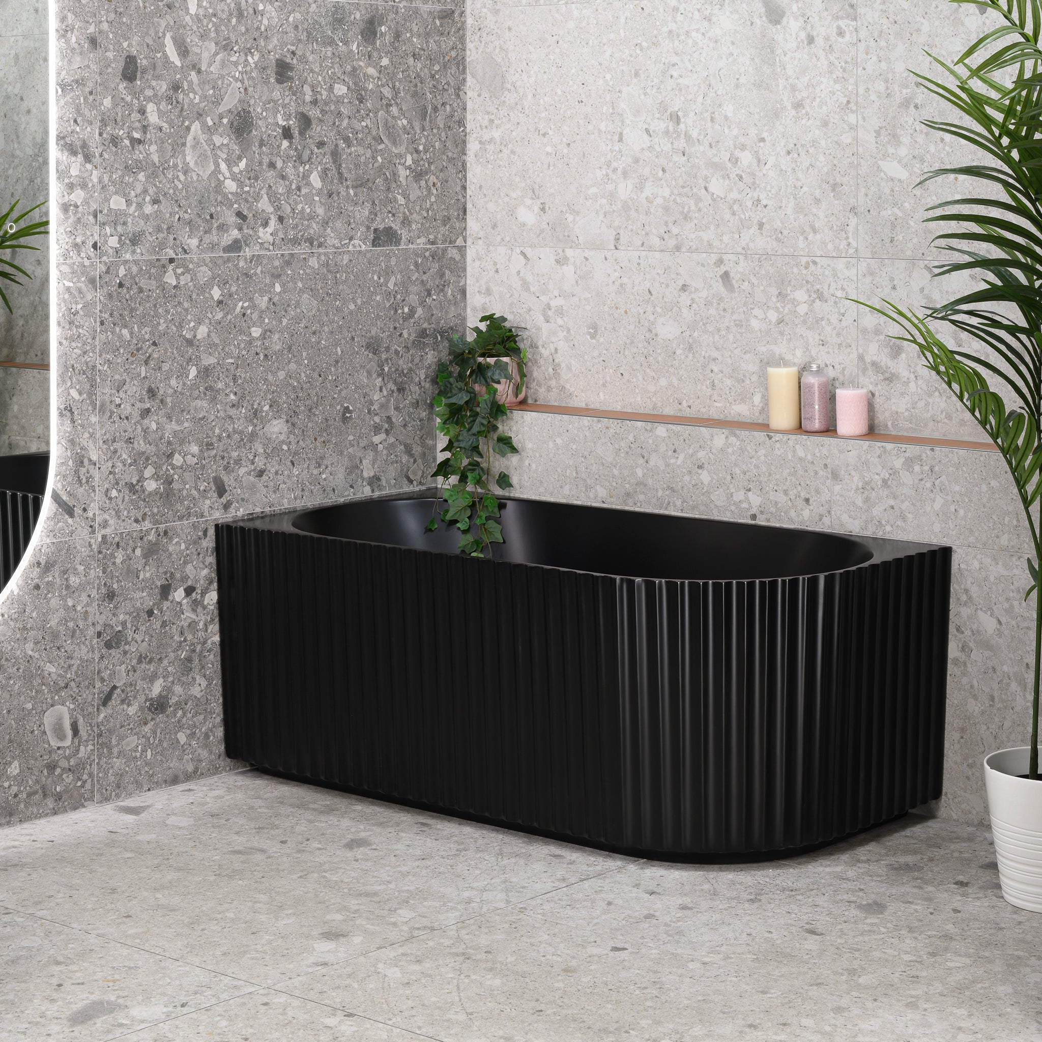
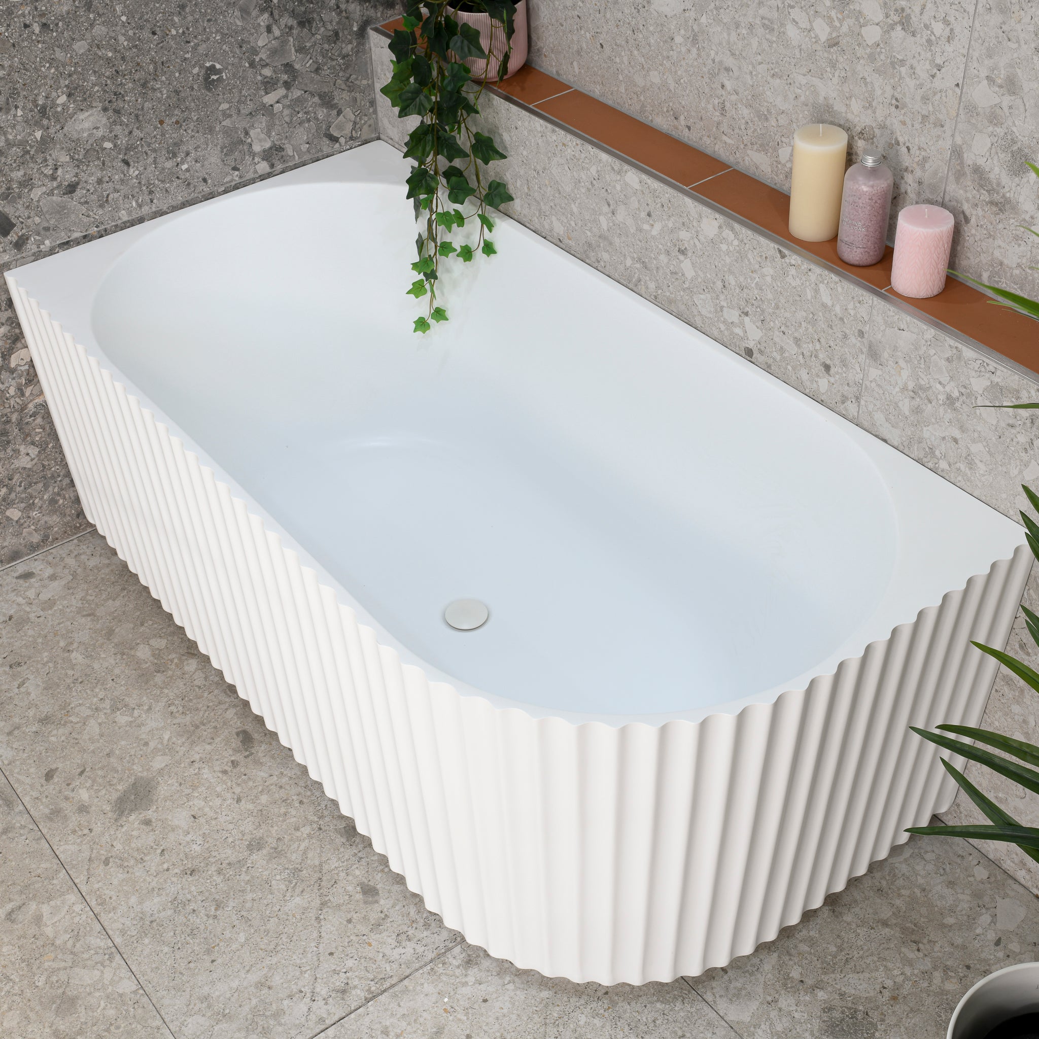
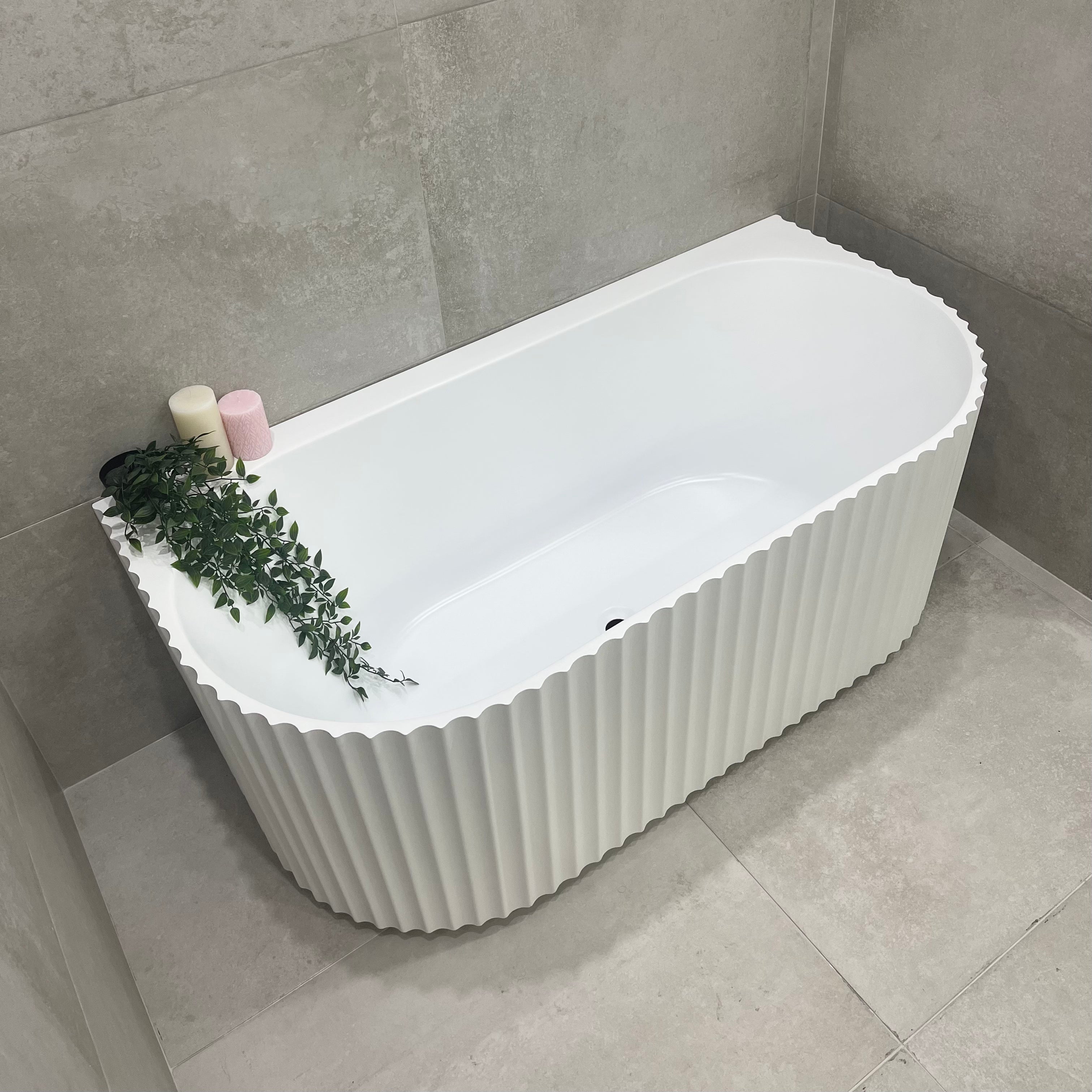
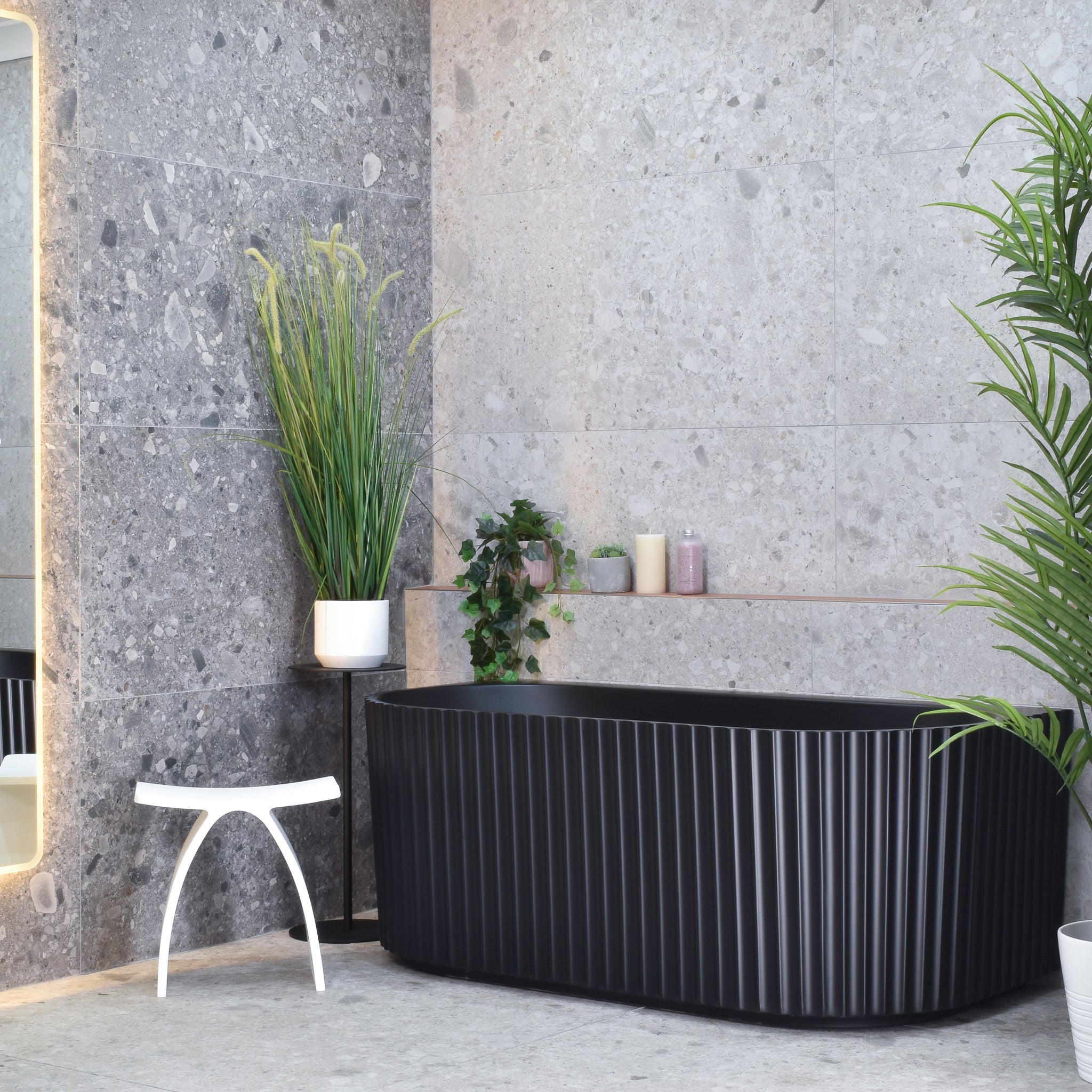
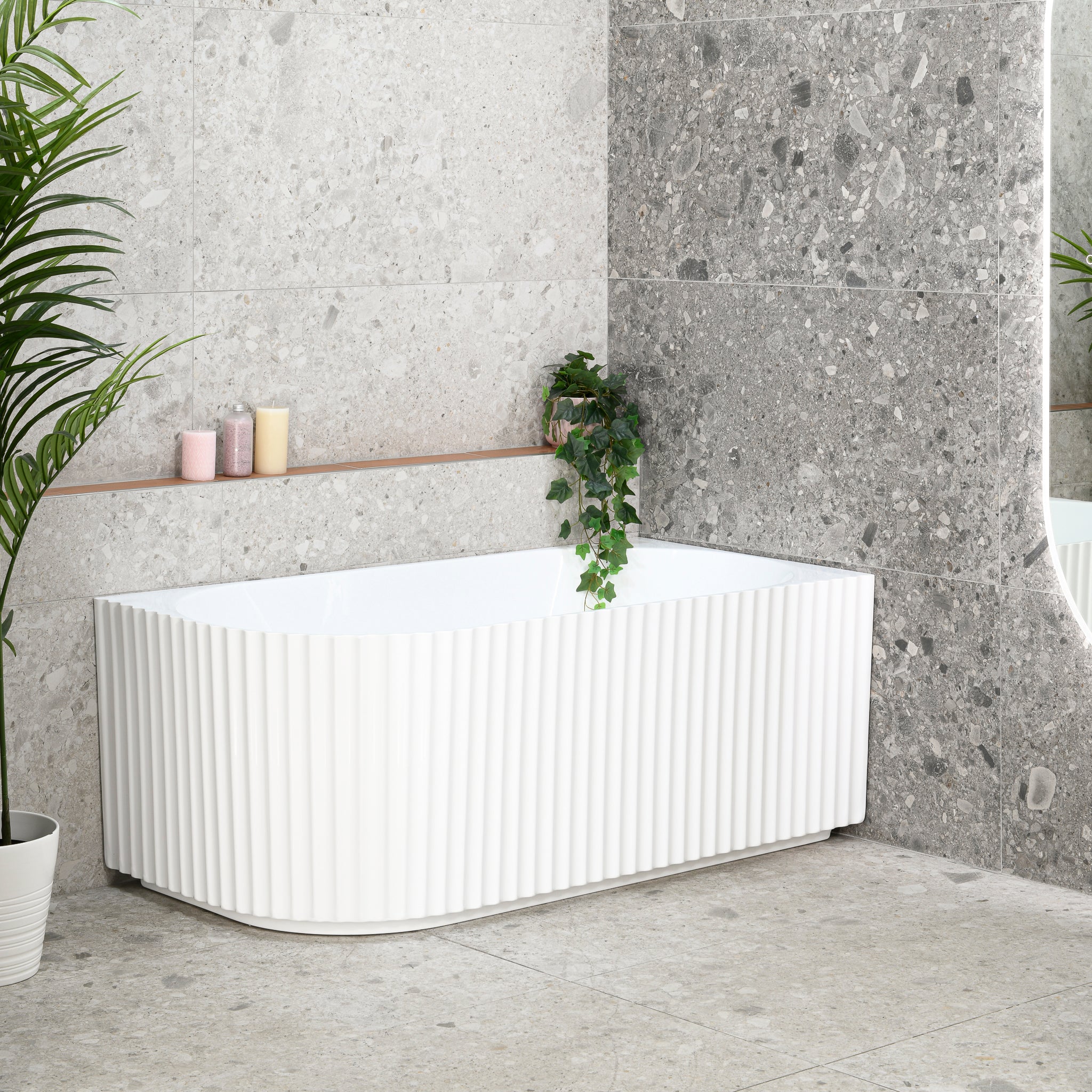
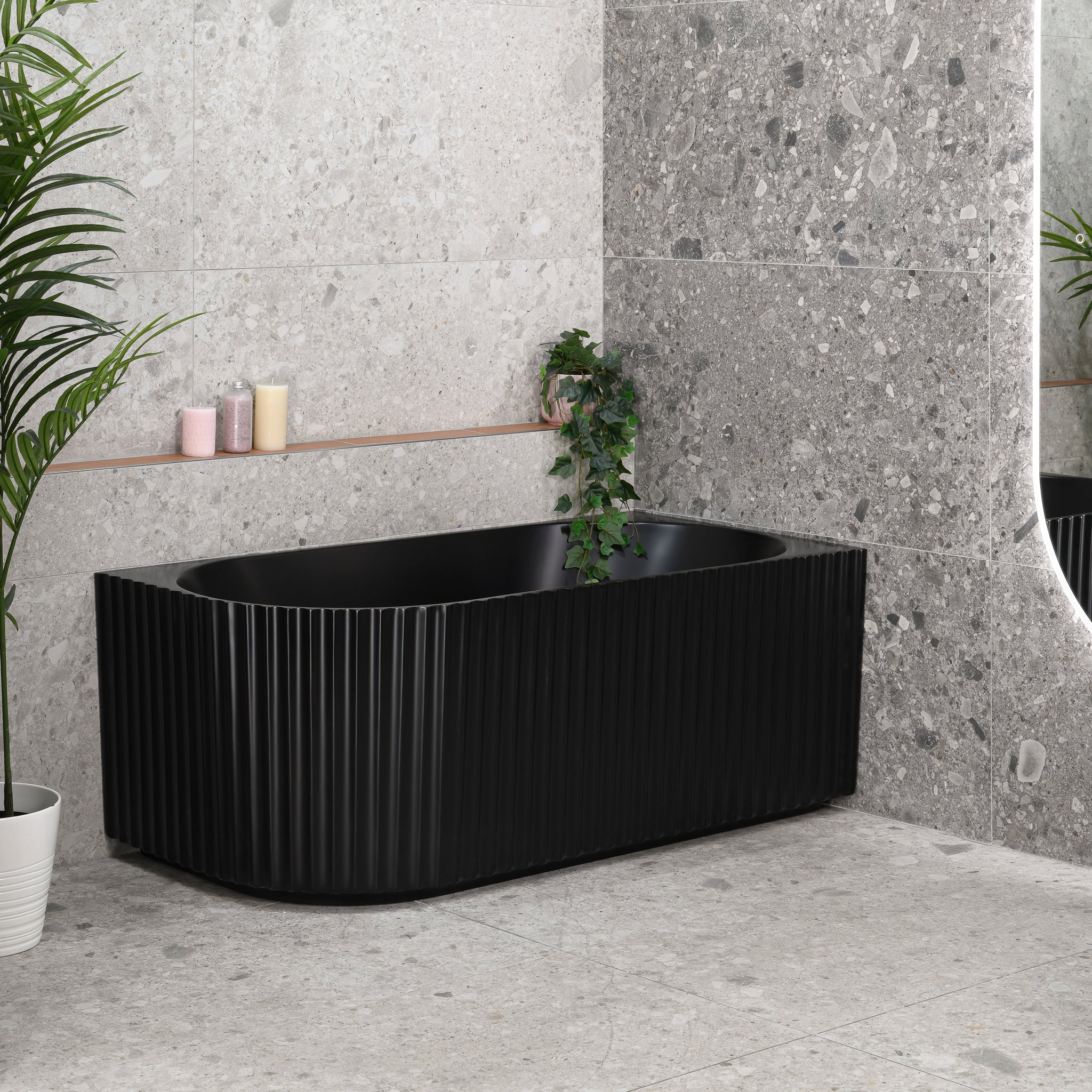
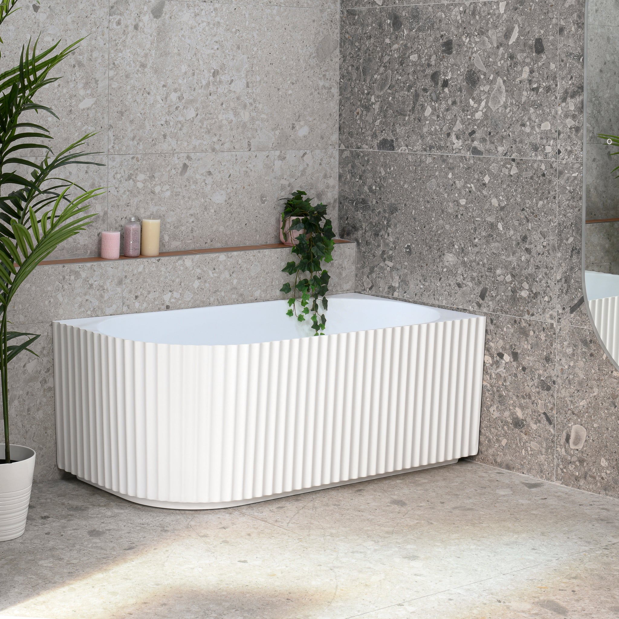
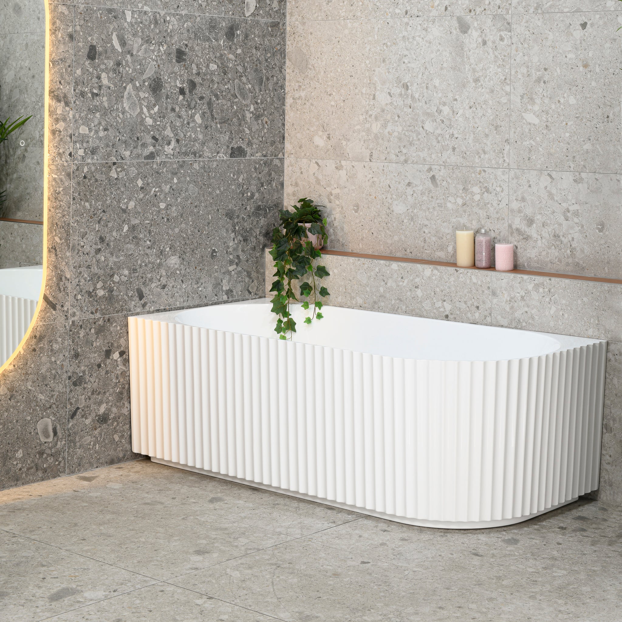
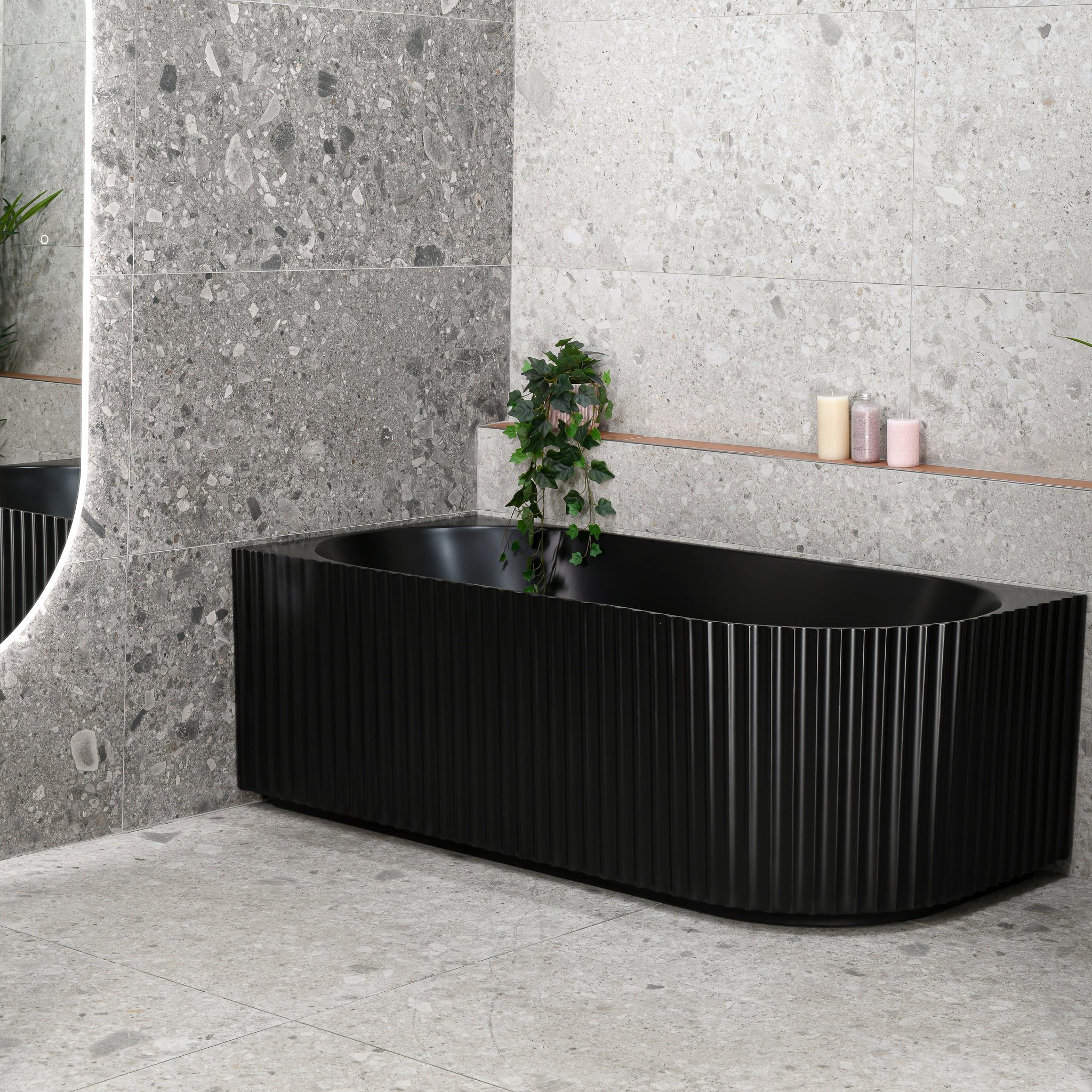
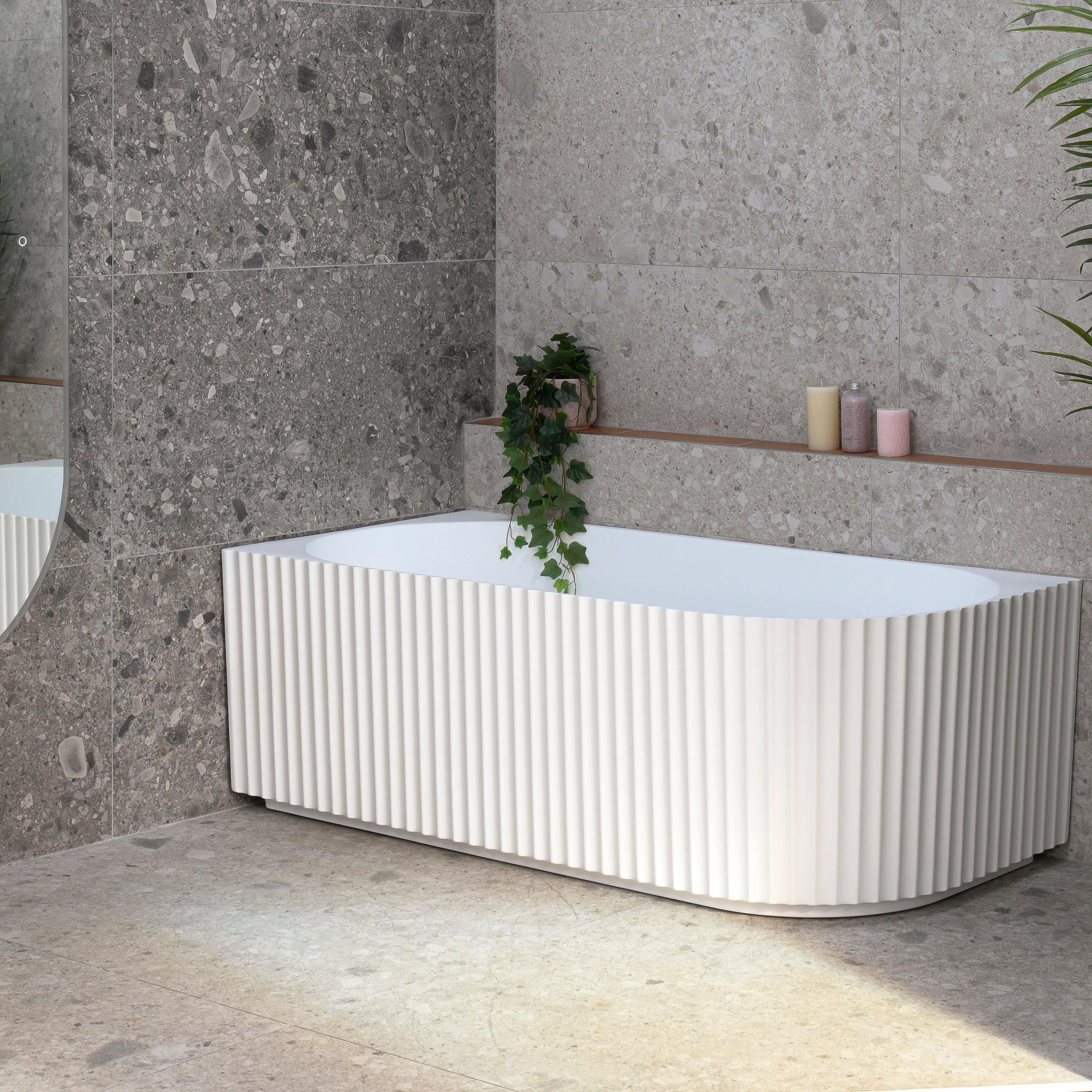
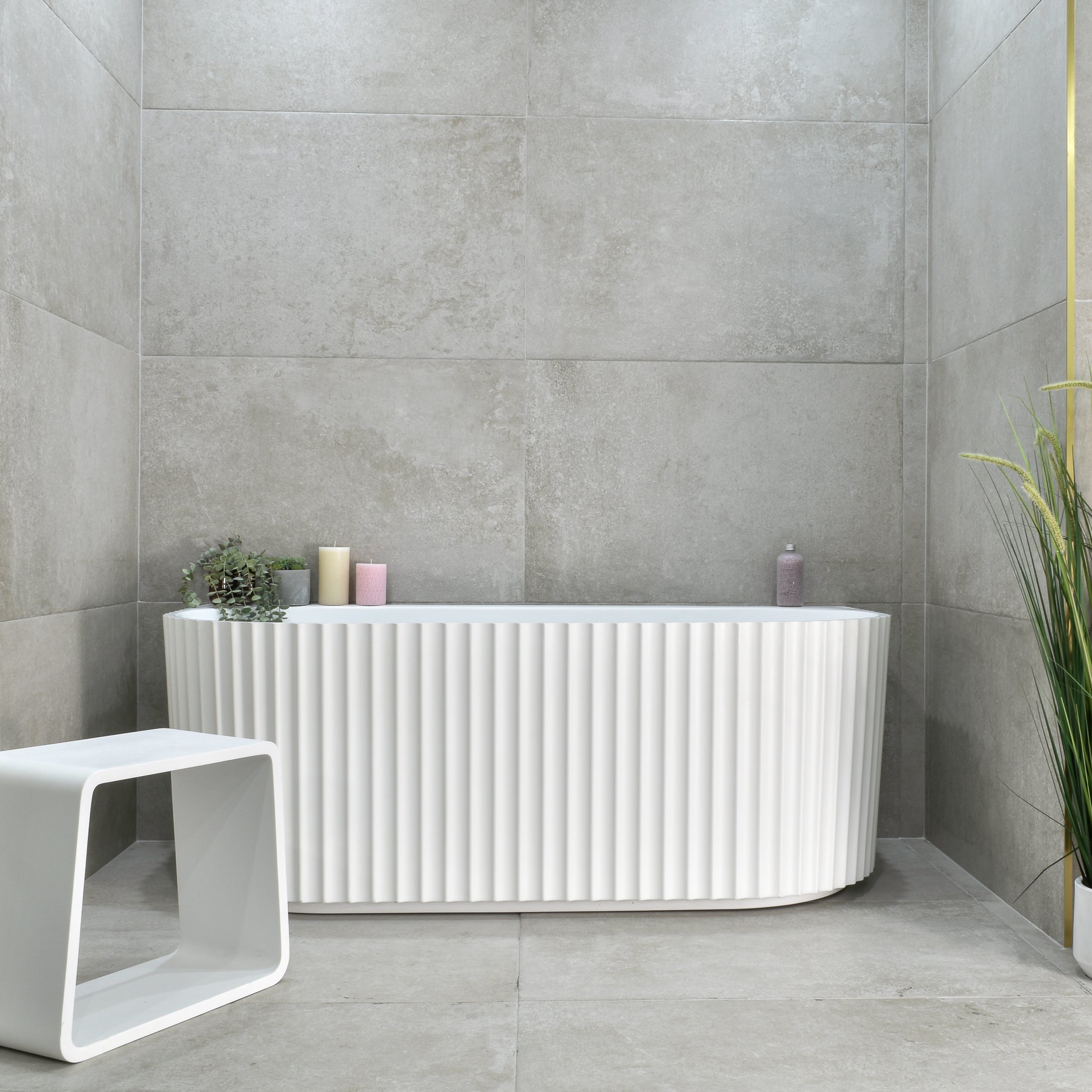
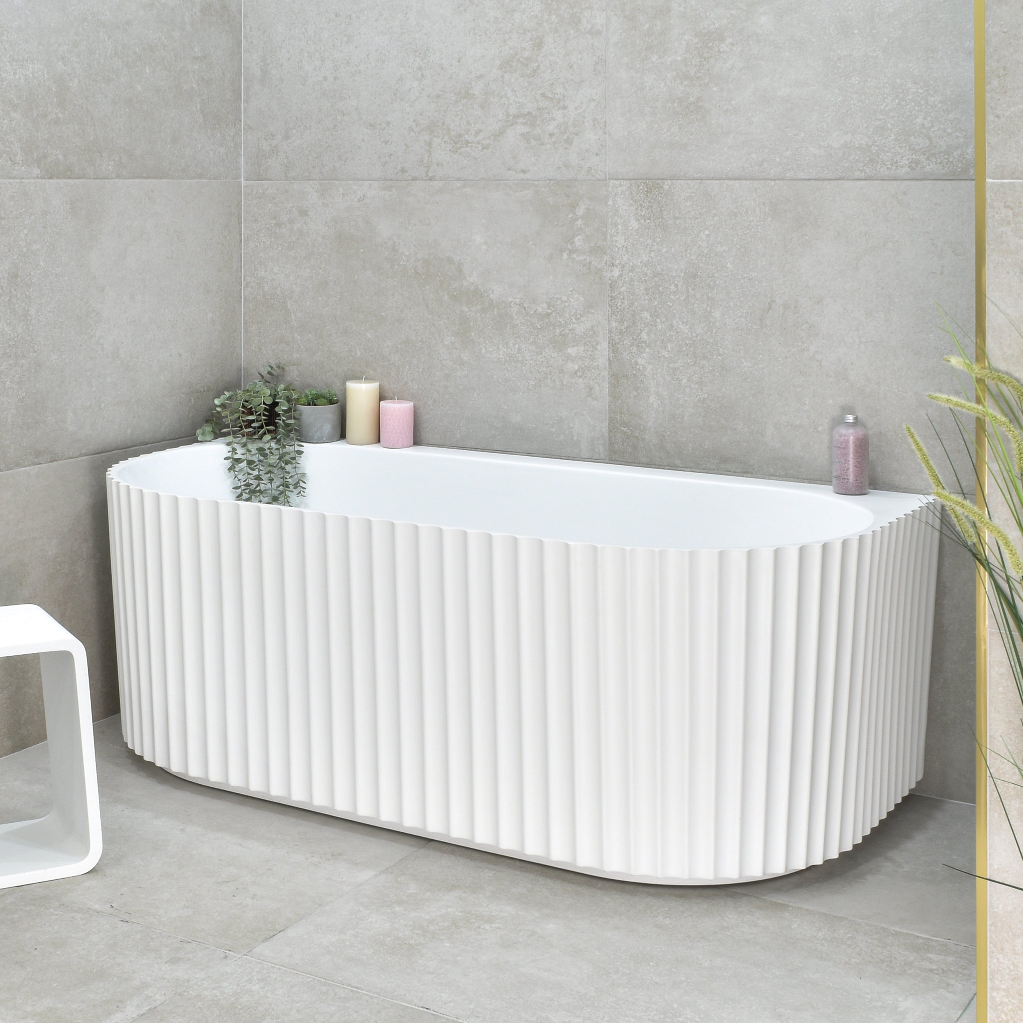
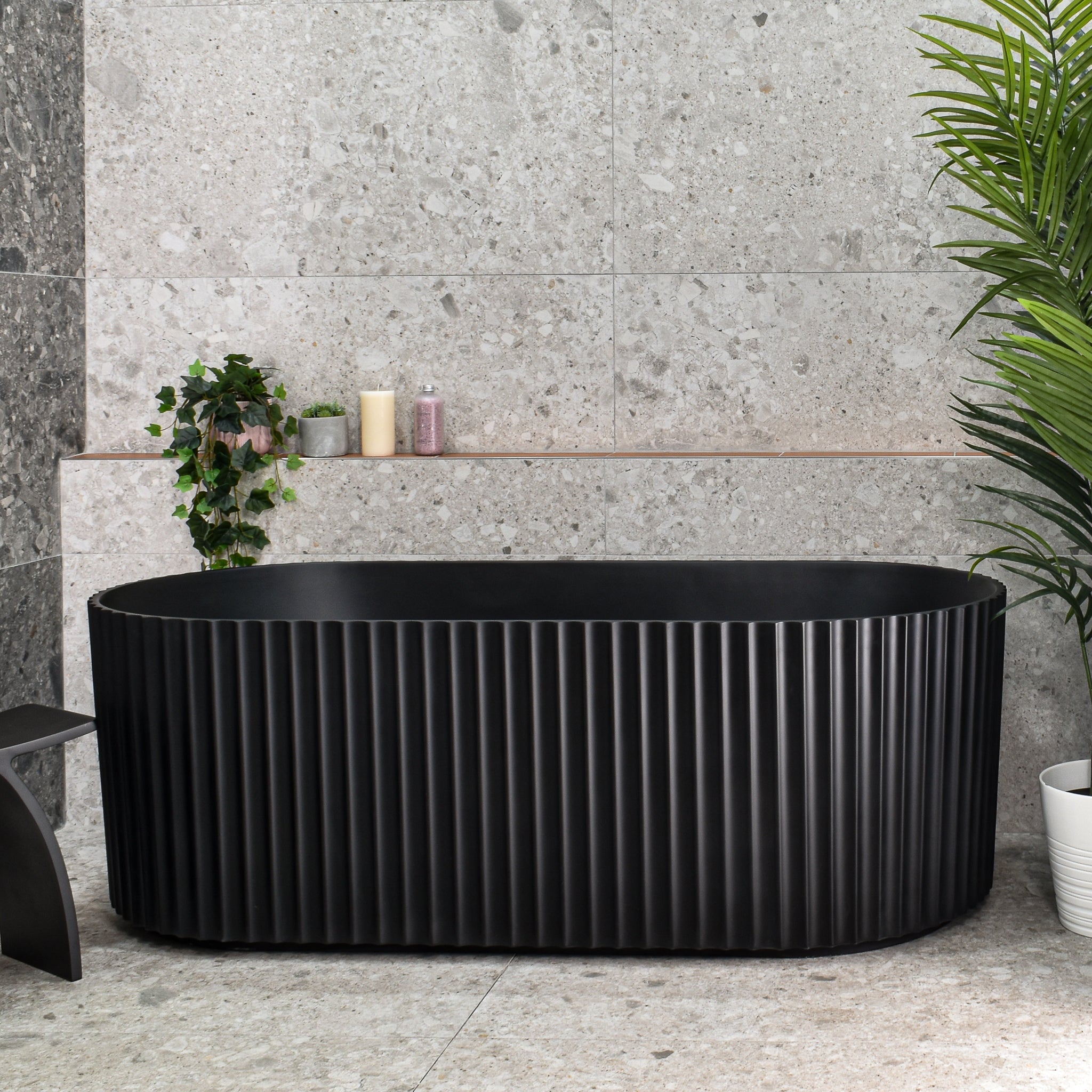
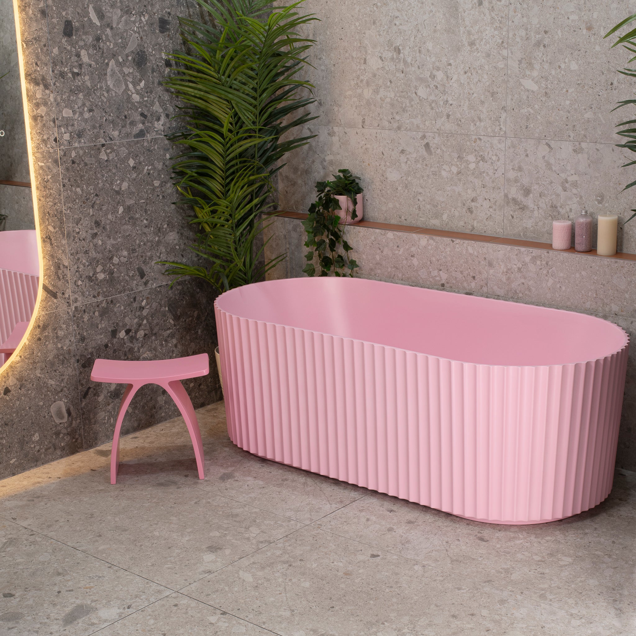
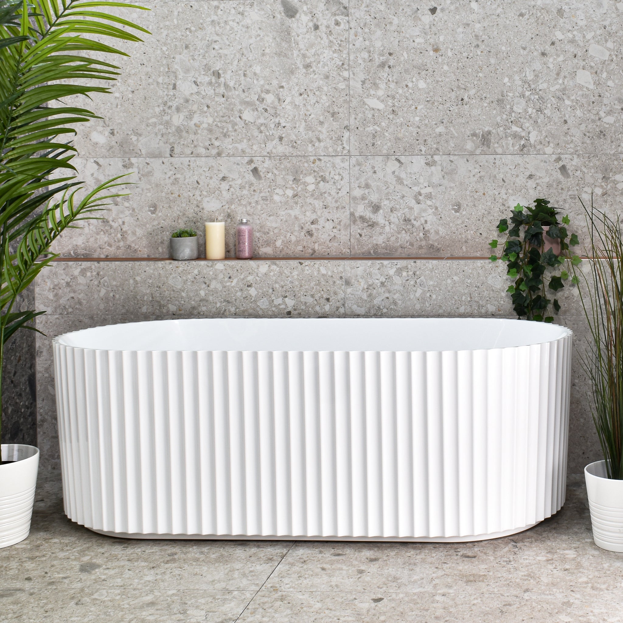
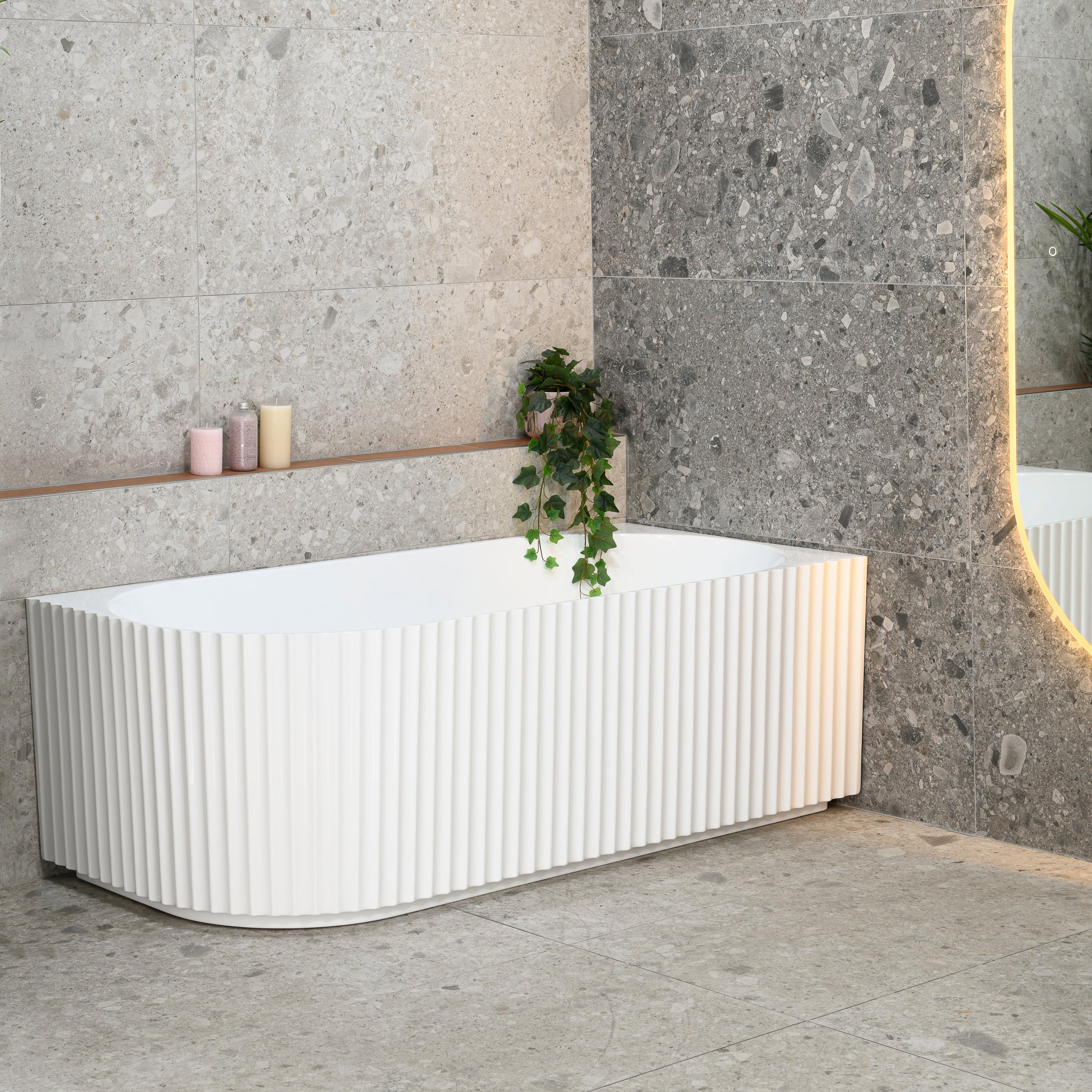
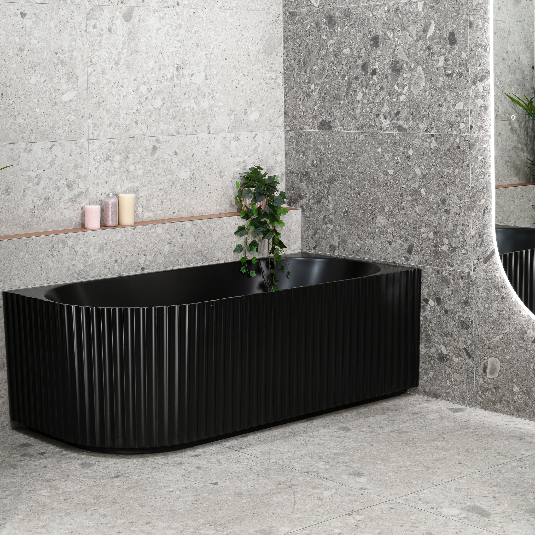
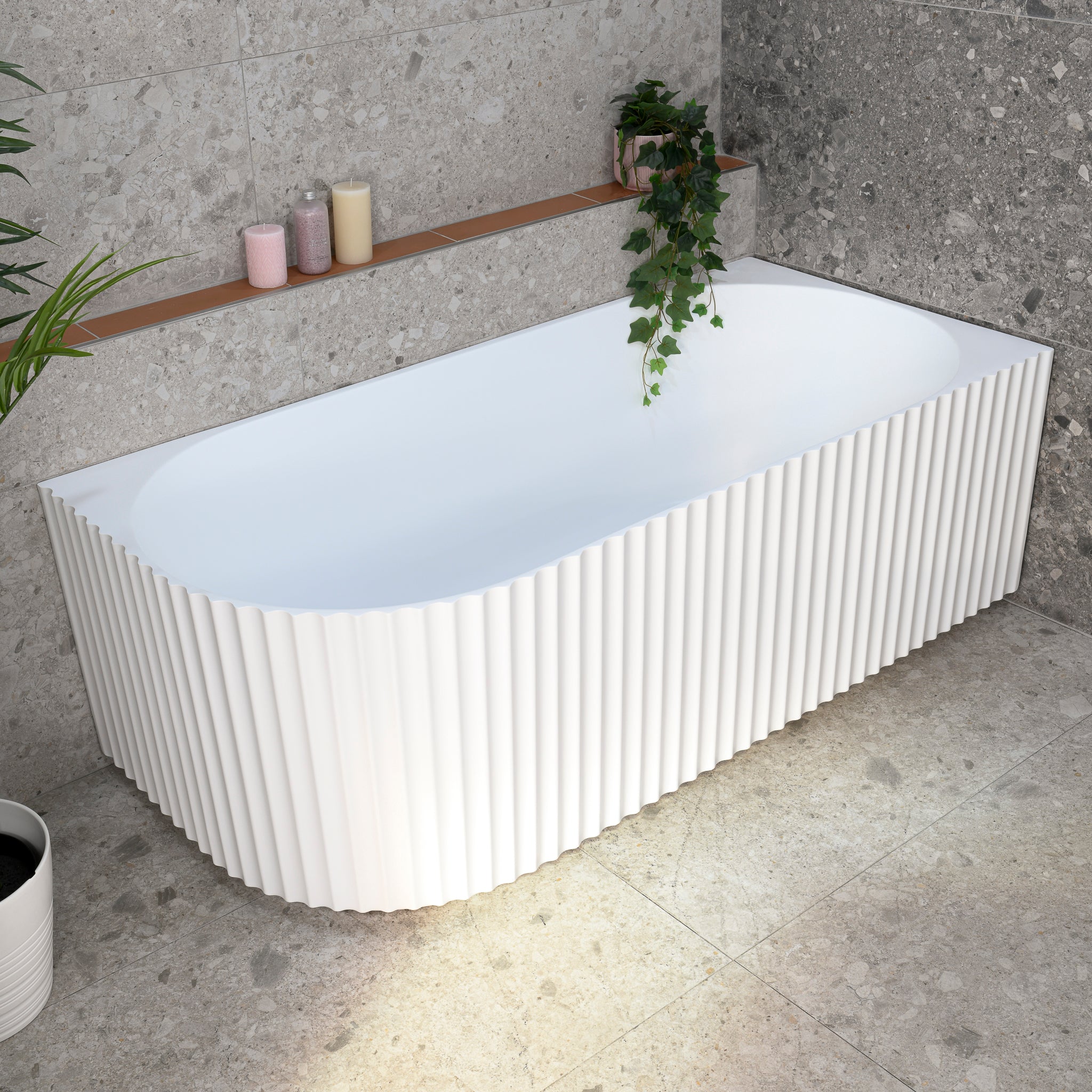
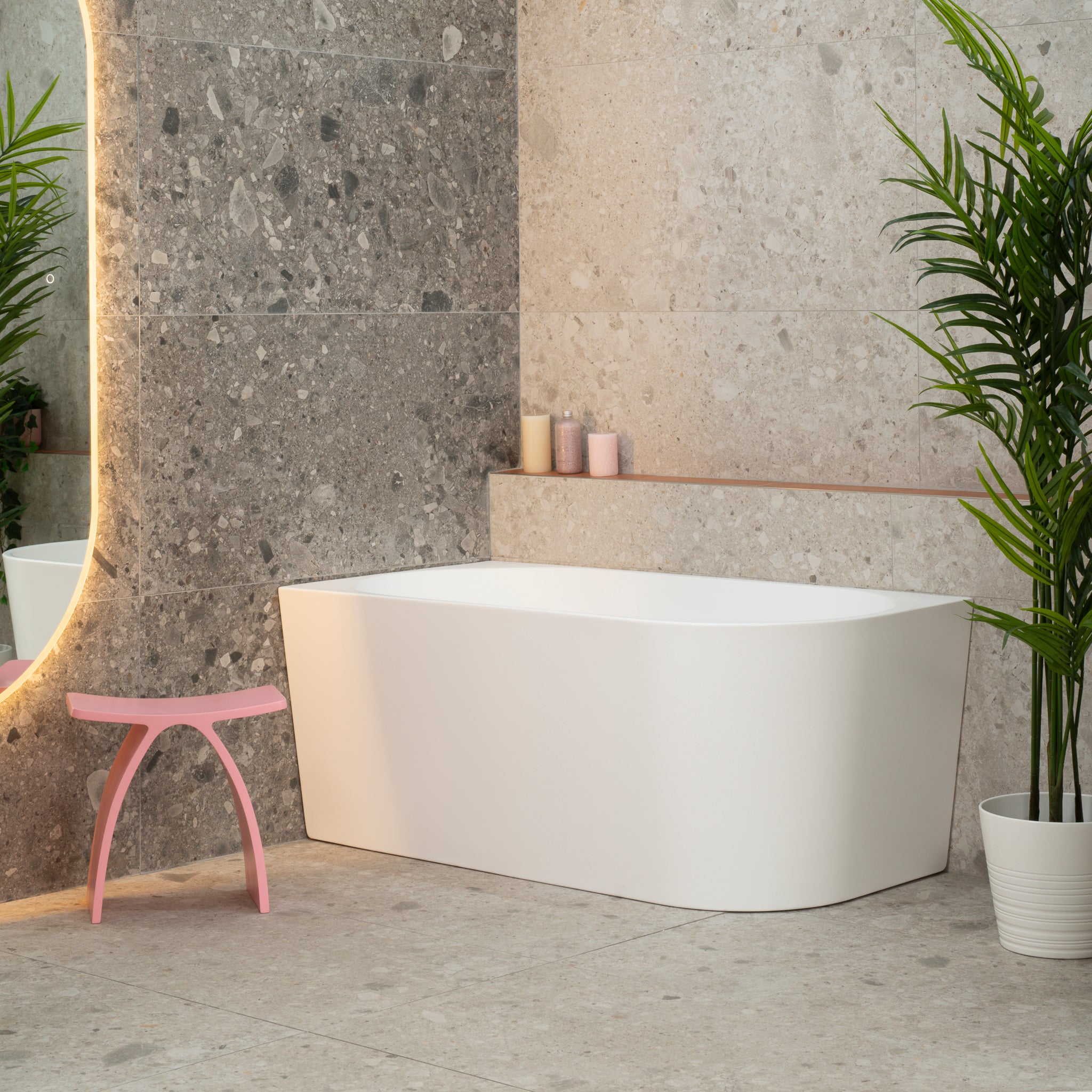
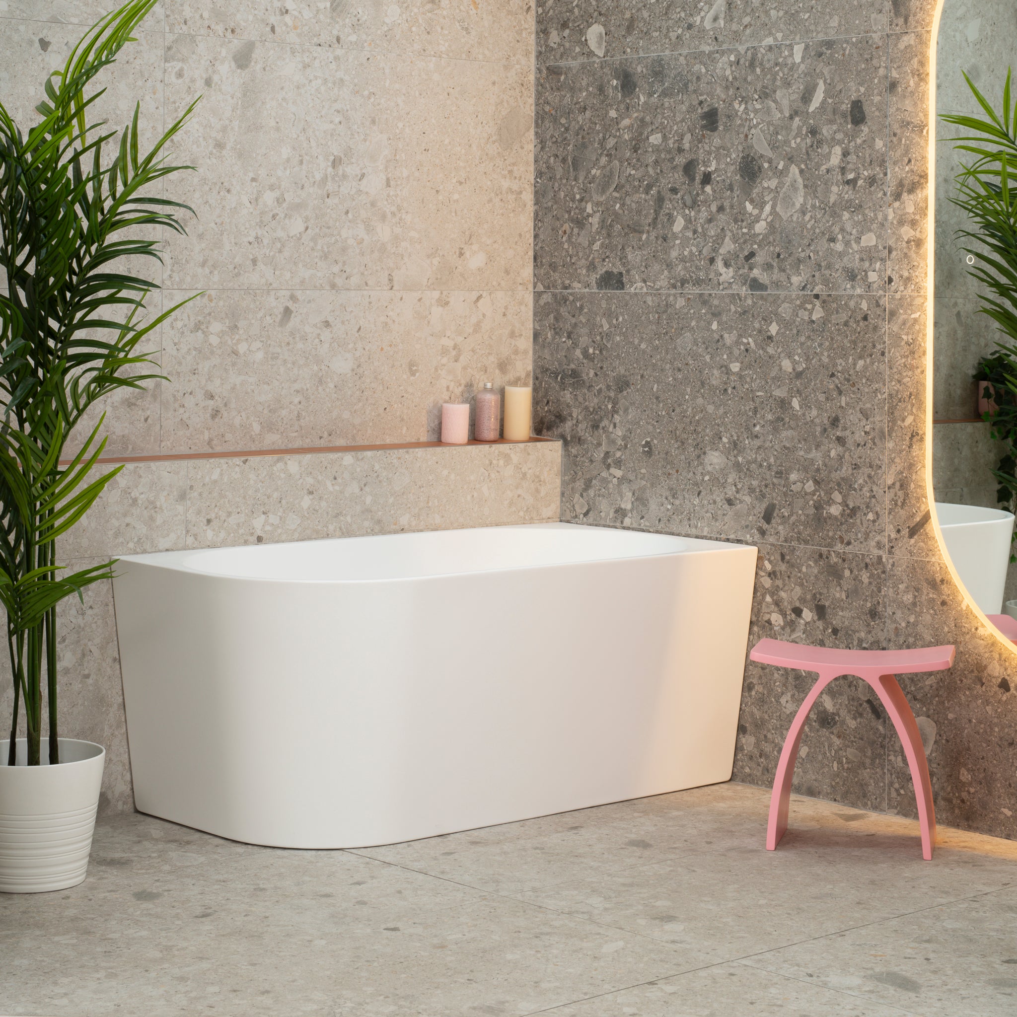
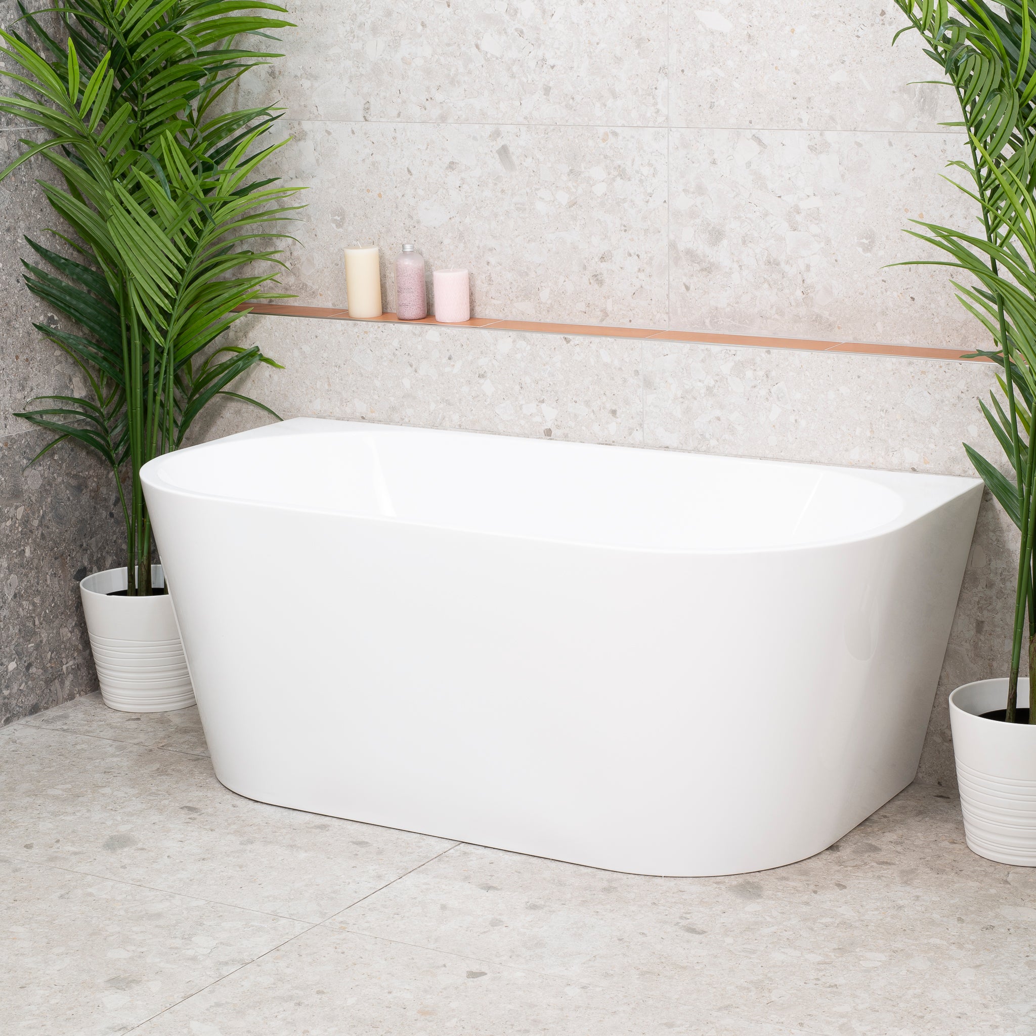
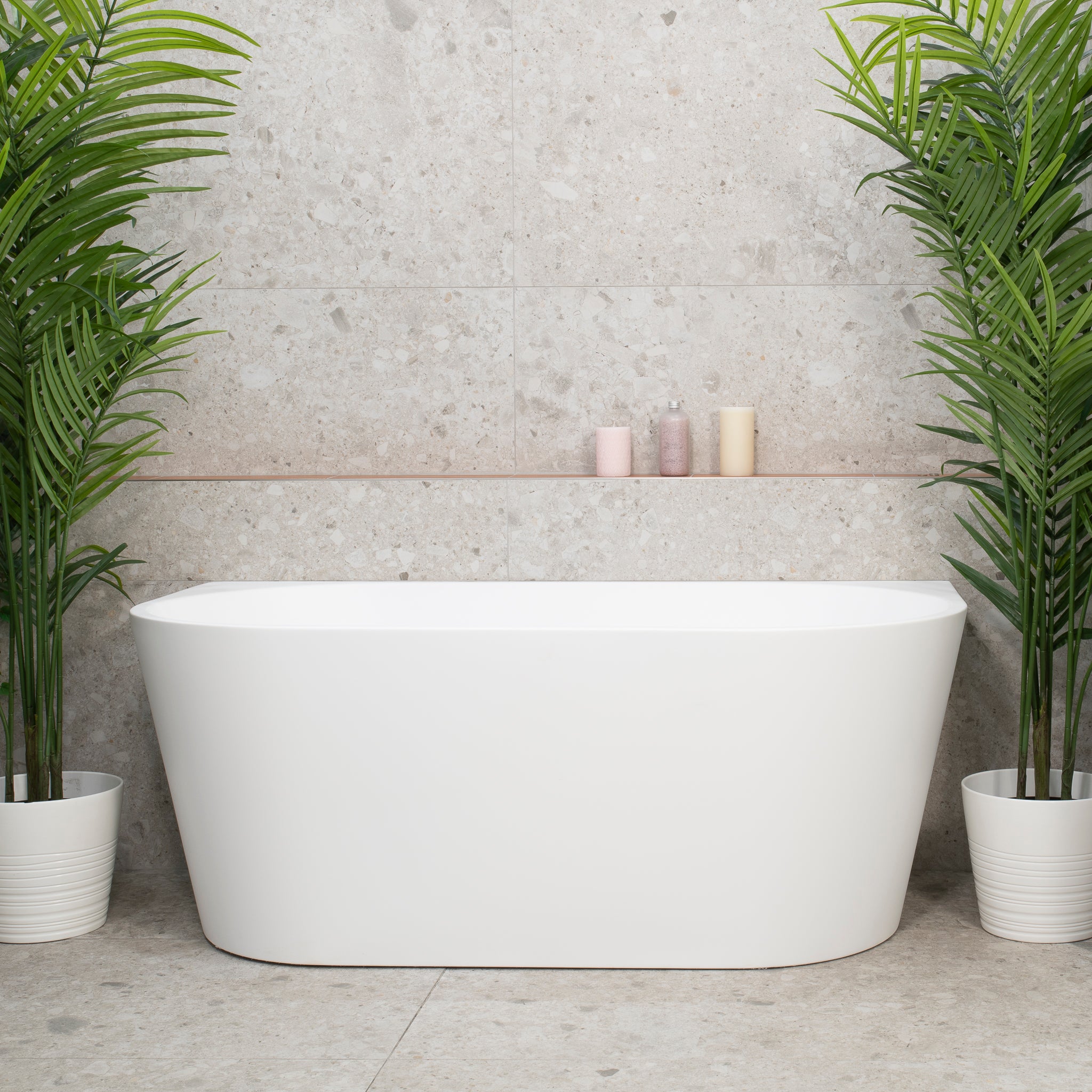
Baths: Most acrylic, fibreglass, Corian, composite, solid surface or press metal bathtubs are white and cost effective, however, black baths have been appearing in an increasing amount of new bathroom designs and can suit some eclectic, classic black & white (also known as monochrome) or contemporary looks. Other colours are not easily found and are probably hard to pull off.
The trend is for bathrooms to use freestanding baths now, which stand out much more than the inset baths you may be used to. This means that a colourful freestanding bath will be much easier to pull off than a colourful inset bath.
You can get stone, rock, concrete and composite baths in a variety of colours and finishes, the most common alternative colours are varying shades of grey, beige and brown. These can really add value to the design of your bathroom at the cost of more maintenance. A great example are the strong eye-catching travertine or concrete baths.
The major trade off with these baths is price, with the cost of purchasing one frequently being over $2000, and that’s before noting that getting them delivered and brought into your bathroom might be impossible or very expensive due to their weight.
Still, it can be a good idea to go all out on a bath, though we recommend non-acrylic baths only if you have the budget for one. The costs are significant but there is little practical value.

Toilets: It’s easy to find white toilets everywhere, and there are also black toilets showing up in some modern bathroom designs. Black can be a good design idea in an appropriately themed bathroom and can match a black bathtub. Keep in mind that white is the most hygienic colour due to stains appearing more visibly, so black offers little practical value as the antithesis to that.
You can also get coloured toilets but they may be harder to find. We are observing that in 2018 there alternative colours slightly trending such as light grey toilets, these will work if you want something trendy that isn’t white, but if you’re content with white then you will save a little.
The best toilets are toilets with the cistern hidden behind the wall. This is both for practical purposes as well as for the look. You may also get coloured buttons in a variety of styles that will match the rest of the colour scheme and are sure to look good. We strongly advise concealed cistern toilets, especially in small bathrooms.
Vanities: While most vanities are white, there are a lot of coloured options which can accentuate a particular bathroom style you are going for. You can get a variety of cabinet finishes in almost any colour and can even get a laminate veneer that looks like timber. There are also many options for the vanity counter top and sink. Some tips for vanities are below:
- White vanities can be used with almost any tile colour scheme and will look great
- You can colour your vanity similar to the floor tile (or feature wall) to match it
- Warm coloured vanities in timber coloured hues work very well with single tone tile colours that are cooler, such as greys or whites
- Dark vanities make a strong statement and attract visual attention, use with care
- Coloured vessel sinks, also known as above counter basins, look good with white bench tops or suspended white benches, otherwise a white basin looks good with everything or black suits a few colours

Taps and shower screens (frame and fixings) have historically been chrome; a silver colour, generally bright and glossy, though you may have seen older bathrooms with white or gold tapware. The shower glass is generally clear, though you may also have tinted, frosted or otherwise creative designs.
Today, taps come in a variety of colours & finishes, the most common being chrome, matte black, brushed stainless steel, brushed nickel, brass (aged, rustic & brushed), rose gold, gunmetal and gold (brushed or polished). Each can work with your bathroom design, and it’s trendy to use these colours quite creatively and boldly.
A quick list on what’s in-style when using a particular finish:
- Bright chrome remains the most popular finish, it works with almost any bathroom design
- Matte black is a bold colour, best used to contrast with light coloured tiles, works well with almost any neutral tile design
- Brushed chrome, nickel or stainless steel are trending due to the ability to show less water marks, you can use these finishes almost anywhere like bright chrome
- Brass tapware look fantastic in a themed bathroom designed with fitting a particular era, works great in industrial, steampunk, outdoor, mid-century and old English themed bathrooms
- Rose gold is best used in simple two tone bathrooms, it can look fantastic with black and beige
- Gunmetal is a finish that is quite neutral but dark, best used with complementary light gray hues throughout
- Gold finish tapware look best with light marble colours throughout the bathroom, and can also work with white and black schemes. It can be risky to use gold with other colours.
You can also get two-tone taps, the most frequently seen ones use black. Black and chrome, black and rose gold and black and brass/nickel are popular. These work really well with contrasting colour over a light coloured single tone tile.
Accessories and grates are now available in most of the finishes you can get tapware in. For example, you can get gold accessories that match gold tapware through most suppliers which sell that finish. You can even get coloured vanity wastes and overflow rings!
For floor wastes, tile insert grates reign supreme, and these are most frequently chrome or black. If you opt to use tile insert grates, keep in mind you will only see a very small perimeter around the tile in the floor, so colour is not too important, hence chrome coloured grates are still a hot commodity.
There are other fittings and fixtures to look out for, especially if you are getting feature lights, keep the principles from earlier in mind and find looks that match everything else you like and you will find it easy to choose the best fit.

Colourful towels and plants can make your room pop a little more
Currently, the most prevalent colours in contemporary bathrooms are whites, grays, beiges, blacks or browns, as all of these colours are neutral, easy to work with and often work well with the rest of the house. Neutral colours can be important for a colour scheme as tiles are “hard fixings”, meaning you won’t want to be changing them often and so the final colours you choose will be quite permanent and lasting. You can also dress up your bathroom with more colour, using items such as towels, plants or nice features to make your room pop a little more.
In many cases it’s also handy to match the rest of the home, or at least avoid clashing with it. Having a nice modern look is integral to making your bathroom attractive and lifting the feeling of those who use it.
You want your bathroom to appear inviting, look larger and neatly fit in with the rest of the home, so it’s nice to see that 2016 trends are showing a better understanding of what makes a bathroom’s colour influence these goals. Here are the trending colour schemes and why.
Bathroom Designs & Colour Schemes that are Trending in 2018
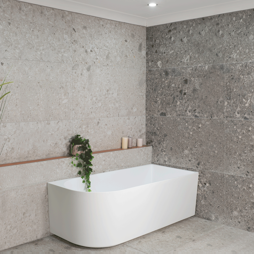
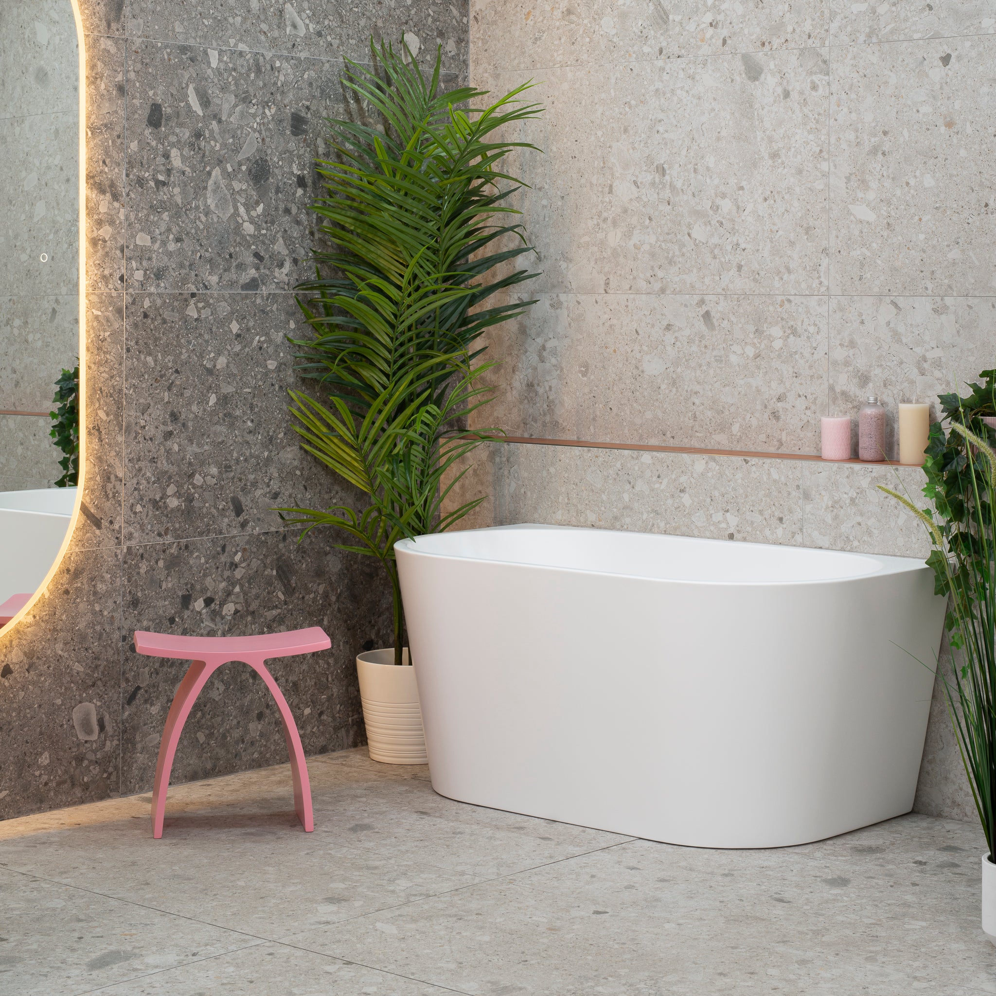
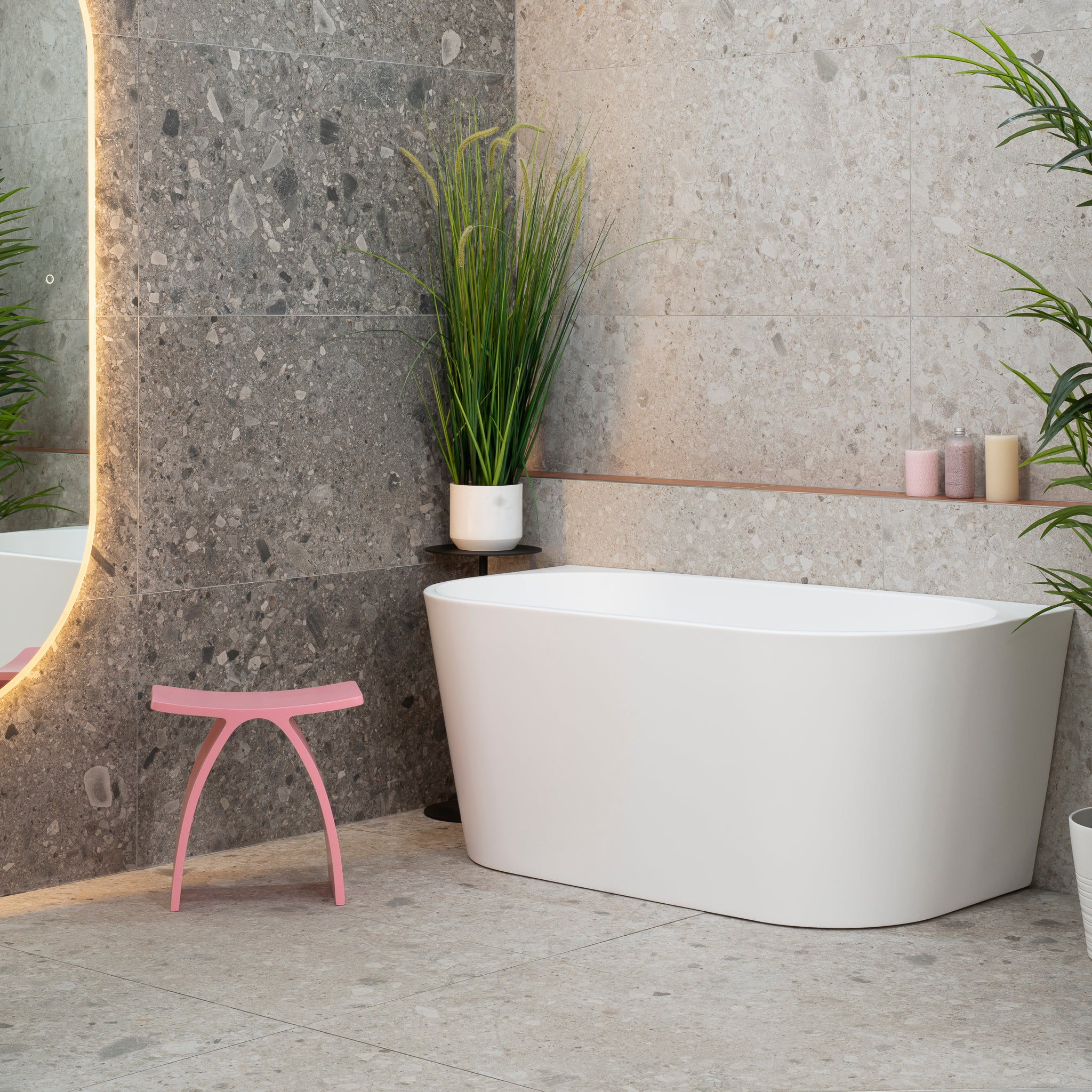
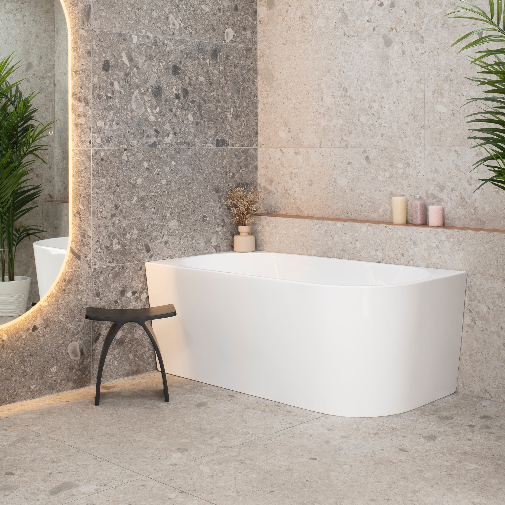
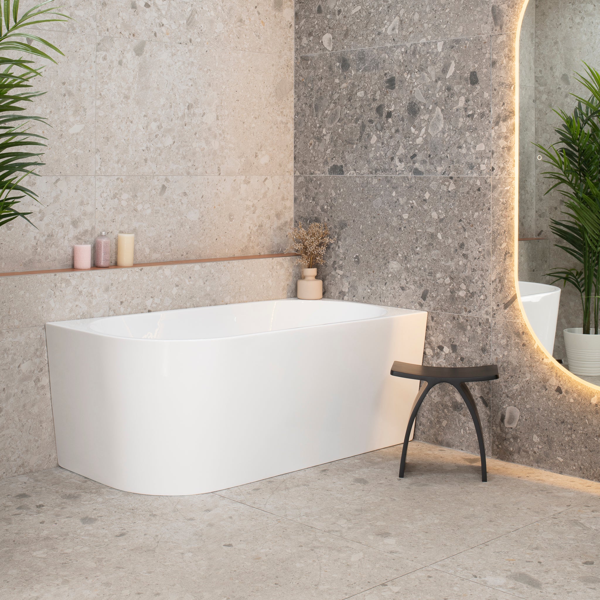
The Concrete Bathroom Look

The industrial and polished concrete looks are big hits. Familiar, cooling tones associated with the colour combine elegantly with the smoothened tile textures to create a pleasant “big place” feel, similar to industrial warehouses we’ve seen. The colour is very neutral and works with most homes. It’s also flexible for matching with bolder colours, so feel free to use bright and vivid towels.
This look goes very well with matte black tapware, you will make a big impact! The more grey the colour, the cooler the ambiance. For a pleasant bathroom you may dress this colour scheme up with nicely matching timber-coloured accents, such as for the bathroom furniture, architraves and little features to add a bit of warmth.
Bathroom Colour Schemes That Work With White

White with some colour is one of the timeless bathroom colour schemes. Chances are its never going away! White is a pleasant and bright colour that ensures the bathroom looks large, open and inviting. White matches everything, so feel free to pick a suitable splash colour that you enjoy.
Neutral tones are typically the “safe” option and less aggressive than the bright blue’s, greens and reds that are so prevalent in older bathrooms. The most common trend sees white being used as the predominant wall tile, whilst the floor is often ran up a feature wall or used with a feature strip to break it up.
Sky Blue Greys

We love the beautiful sky blue marble feature wall

A sky blue gray tile close up – the faint blue is hard to see in a photo
Did you know that blue is the favourite colour of more than 1 in 3 people? Moving into 2019, expect to see a lot of greys with a very slight to slight bluish hue. Sky blue grey is noticeably different to the greenish tinge that most industrial concrete look tiles imitate and adds a little coolness that people love. Its nice to be subliminally reminded of a soft blue sky as you walk into a bathroom, so its no surprise that this is the new emerging trend.
Sky blue greys combine the flexibility and neutrality of grey with the popularity of blue to create an open, inviting and gentle ambience that may be easily matched with richer splashes of coloured accents. Combine it with a complimentary tile colour for a hot two-tone look and spice it up with warmer accents, such as timber coloured.
Timber Hues

Tiles that look like timber make a beautiful feature wall
Traditionally, timber has been difficult to use in the bathroom. It’s not as resilient to water as tiles and its certainly much easier to scratch when you knock it with your hair straightener or blow dryer. Timber has still remained a popular choice in other parts of the home, so perhaps it’s no surprise that tiles that imitate timber have been a hit in bathrooms. The possibilities for bathroom colour schemes with timber hues are seemingly endless!
The most popular trend has the rich textured timber look tiles as a floor and feature wall, whilst keeping the rest of the walls a simpler colour. Because of its strong, bold look, timber is most often combined with one or more other colour tones for a multi-tone bathroom design.
Related articles
#84 - Bathrooms: Hexagonal charcoal tiles contrast against all-white walls and furniture
#83 - Main Floors: The Ele Buio runs throughout the ground floor bouncing light
#82 - Bathrooms: Concrete grey with timber coloured vanity and all-white walls by Jenny
#81 - Bathrooms: A stunning metallic tile laid in brick pattern adorns the feature wall
$2,599.00
$2,079.00
$1,699.00
$1,334.00
$2,149.00
$1,690.00
$2,349.00
$1,867.00
$2,299.00
$1,946.00
$1,899.00
$1,450.00
$1,699.00
$1,199.00
$3,499.00
$2,999.00
$2,299.00
$1,839.00
$2,799.00
$2,239.00
$2,499.00
$1,999.00
$2,299.00
$1,839.00
$2,799.00
$2,239.00

$2,499.00
$1,999.00

$2,199.00
$1,759.00

$2,399.00
$1,919.00
$2,299.00
$1,839.00
$2,799.00
$2,239.00
$2,499.00
$1,999.00
$2,399.00
$1,919.00
$2,899.00
$2,319.00
$2,599.00
$2,079.00
$2,399.00
$1,919.00

$2,899.00
$2,319.00
$2,599.00
$2,079.00

$2,299.00
$1,839.00
$2,699.00
$2,159.00
$2,499.00
$1,999.00
$2,399.00
$1,919.00
$2,899.00
$2,319.00
$2,599.00
$2,079.00
$1,749.00
$1,440.00
$1,949.00
$1,536.00
$1,549.00
$1,390.00
$1,649.00
$1,440.00
$1,549.00
$1,390.00
$1,649.00
$1,390.00
$2,049.00
$1,299.00
$2,149.00
$1,399.00
$2,149.00
$1,659.00
$2,149.00
$1,659.00
$1,999.00
$1,299.00
$2,199.00
$1,399.00
$1,999.00
$1,590.00
$1,999.00
$1,590.00

$2,149.00
$1,690.00

$2,199.00
$1,299.00

$2,399.00
$1,399.00